
Withdrawing fiat from a Skrill wallet straight into a crypto wallet was one of Digital Wallets' fastest-growing money-out features – volumes had grown steadily, and a large share of that growth was coming from expanding to new countries. It had also never had a designer properly on it: the journey had shipped, expanded market by market, and accumulated friction that showed up as a funnel drop-off of more than 50% on a single step, and a persistent stream of customer-support contacts.
I designed and ran the discovery for its redesign as a full design-thinking cycle, and I deliberately did not run it alone. Product, engineering, analytics and business went through every step with me, in a series of workshops: agreeing a 12-month goal and the success metrics behind it, gathering the evidence, building a proto persona and mapping the journey, then prioritising the problems that best address our long-term goal. From there we ideated against the winners, put the proposals through design reviews and usability testing, and shaped the scope for development.
The redesign increased first-page landings on the "enter amount" step by 25% in a quarter, and monthly withdrawal volume grew from 10K to 15K transactions per month.
The spine of the initiative was the double diamond: diverge and converge on the problem, then diverge and converge on the solution. I opened the very first workshop by walking the room through it – five minutes on empathise, define, ideate, prototype, test – so that everyone knew at every later session which part of the process we were in, and why we're going through it.
That set an expectation early: we would spend real time in the problem space before talking about solutions. On a feature this data-rich, that was the discipline that mattered most. It also changes how a workshop feels – less "the designer is making us do sticky notes", more one step in a process the room can see the whole of.

The friction. Growth for the Withdraw to crypto wallet feature was happening despite the journey, not because of it. Quantitative research had already surfaced the problem – more than 50% drop-off on the details-completion page – but it lacked substance: the why behind what was happening. So I gathered the product team to map out every hypothesis we had for that drop-off, and to mark against each one what kind of experiment or research would confirm or discard it.
The open question on users. Alongside it sat a second question: who are the target personas for the future of this feature, and what are their needs and pain points? Quantitative data already told us the feature was serving a specific niche of users with very specific needs – we had to understand them properly to elevate their experience. We also wanted to explore whether the feature would serve our existing crypto personas.
The initiative ran as a series of working sessions, each with a written agenda and a timebox on every exercise. Two things were deliberate: silent individual writing before any group discussion, so the loudest voice in the room didn't set the frame; and dot-voting to converge, so decisions came from the group rather than from me. That is what made the outputs hold when we returned to them three workshops later.
With the help of product, analytics and customer support, I gathered all the data we had onto one board, where every later exercise could see it. Five sources, each answering a different kind of question:


The analytics could say where people left; they could not say why. So I gathered the product team and we wrote down every hypothesis we had for that drop-off – discoverability, a KYC timing issue, expectation mismatches between web and app, no available balance, difficulty entering an address, balance-switching limitations on app. Against each one we marked what kind of experiment or research would confirm or discard it: some against BI data, some in the interviews, some in usability testing.
That list is the hinge of the whole initiative. It is what stopped the quantitative work from being a set of charts everyone nodded at, and turned it into a research agenda with owners.
The research questions and topics were shaped with stakeholders before the study began, and written up into a guide covering onramp behaviour, withdrawal habits, pain points and unmet needs.


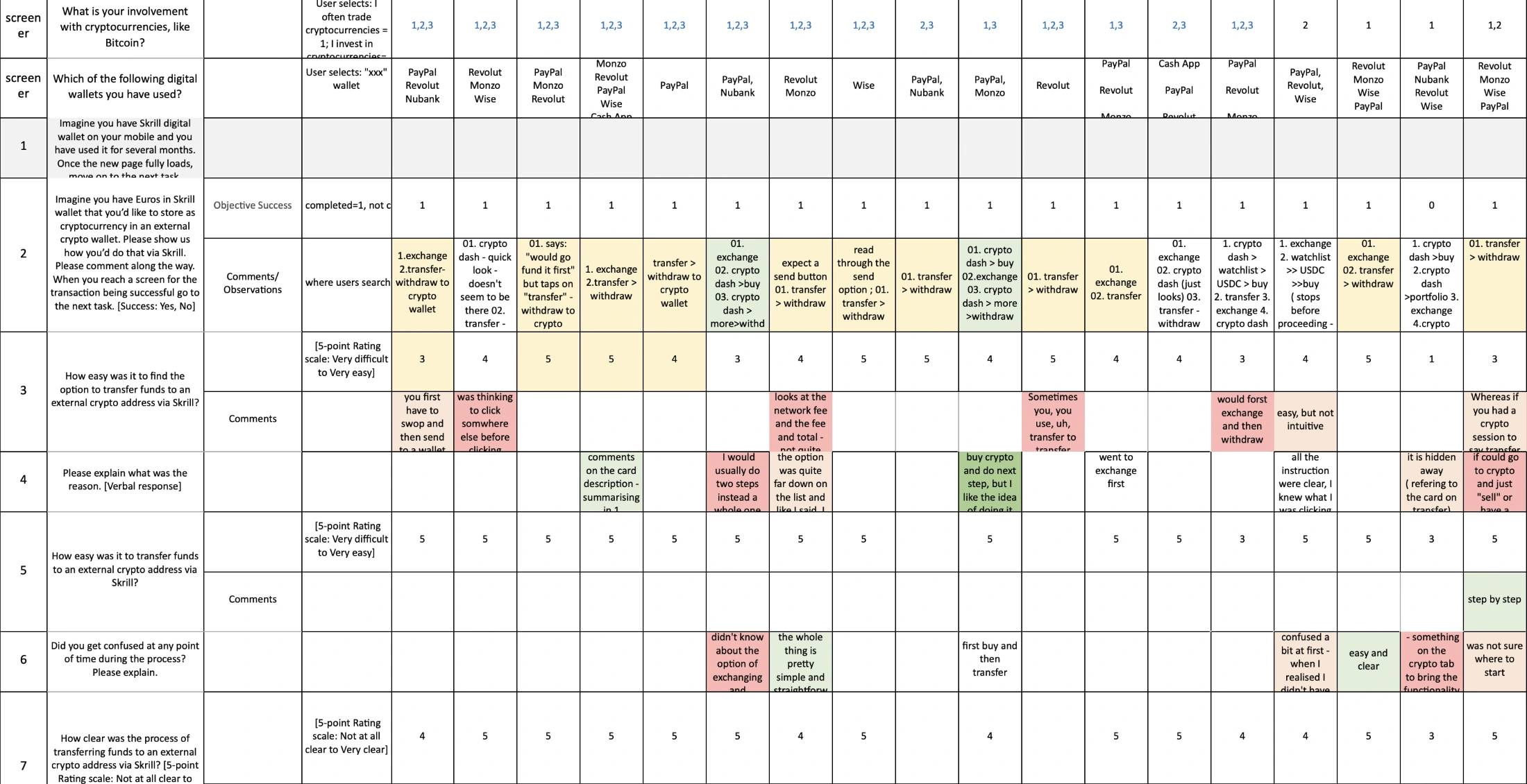
Ten moderated sessions on mobile – five Skrill users and five non-users, across the UK, Brazil, Italy, Portugal and Argentina: seven trade cryptocurrencies, six invest in them, six withdraw funds to crypto wallets. Two findings did most of the damage.
Discoverability. Only 5 of 10 users managed to complete a withdrawal to a crypto wallet at all, because they couldn't find the feature. Seven of ten began their search in the crypto tab, starting from "buy crypto" and then hunting under "more"; three started from the exchange; transfer, where the feature lives, was the last resort. Asked how easy it was to find the option, users scored it 3.2 out of 5 – and the score flatters the experience, because half of them never found it.
Clarity. The withdraw-to-crypto-wallet concept is not what traders are used to from exchanges. They expect to buy crypto and then send it to an external wallet, or to send from an existing crypto balance. Here the feature buys crypto with fiat and sends it to the wallet in a single step, acting as an on-ramp. Genuinely more convenient, and genuinely confusing: users couldn't tell what the feature was or how it worked.


The first workshop was pure alignment, run in tight timeboxes: five minutes on the process itself, ten on the goal, ten on metrics, five on scope and constraints. Everyone wrote silently first, then we discussed and dot-voted.
"What would Withdrawals to crypto wallet look like in 12 months for our users, and how would it impact the business?" One sentence each – bold and idealistic, no metrics, no solutions. Everyone wrote in silence, then we read them out and dot-voted to land on a single statement the whole room had chosen rather than been given.

"How will we know we've reached our goal?" – split into business outcomes and user outcomes, with the instruction to imagine everything goes perfectly and to include a number where possible. The room produced candidates on both sides – conversion through the withdrawal flow, volume growth, fewer support contacts – and voted on the ones it believed in.

Boundaries before ideas: what the initiative covers on app and web, with regulatory, technical and product constraints named explicitly – so that nobody fell in love with something that couldn't ship.
"Imagine the project has failed miserably. Write every reason you can think of for the failure." Two answers mattered: that we did not get to the core of users' problems and needs, so we did not provide enough additional value; and that we had a hypothesis we did not test or measure, so we built something that did not actually improve the experience or the metrics. Those two became the standard the rest of the process was held to.

With the destination set, the next workshop turned to whom we were designing for. Working from the interviews, the BI segments and the team's accumulated knowledge, we drafted a proto persona together – whom are we serving, what are their pain points and needs, what would we help them achieve – deliberately labelled proto: a hypothesis to be sharpened by further research (the user group represents a rather sensitive domain, which led to recruitment difficulties). Alongside the proto persona we also placed our already existing trader personas as secondary target groups.

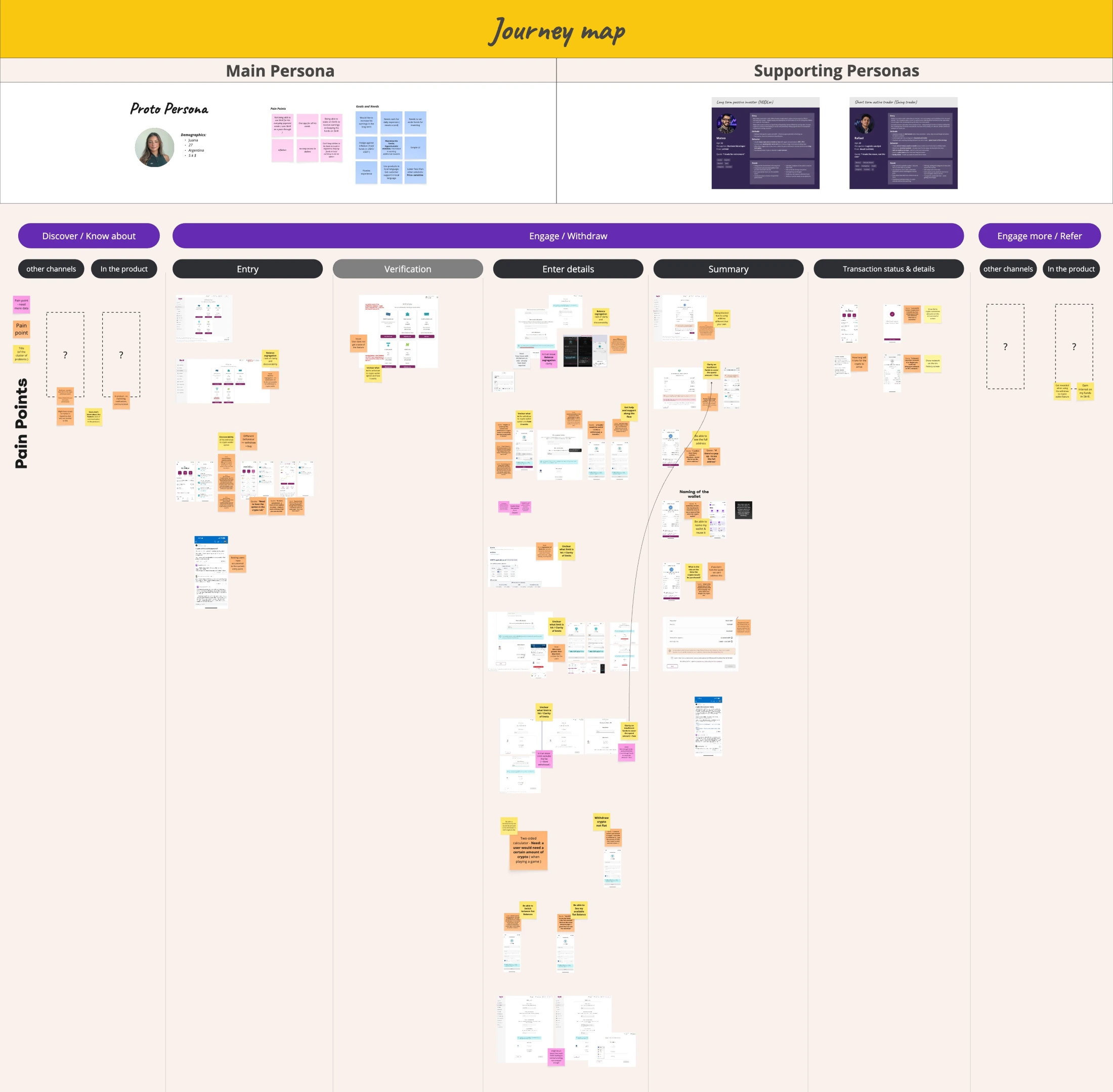
Journey mapping. We mapped the current journey end to end and placed the user pain points along it – from discovering the feature exists, locating it in the interface, through entering an amount, address and choosing a network, to waiting for funds to arrive. The map made visible what the funnel chart structurally couldn't: the pain starts before the first funnel step, because a feature people can't find has a problem no flow redesign will fix.
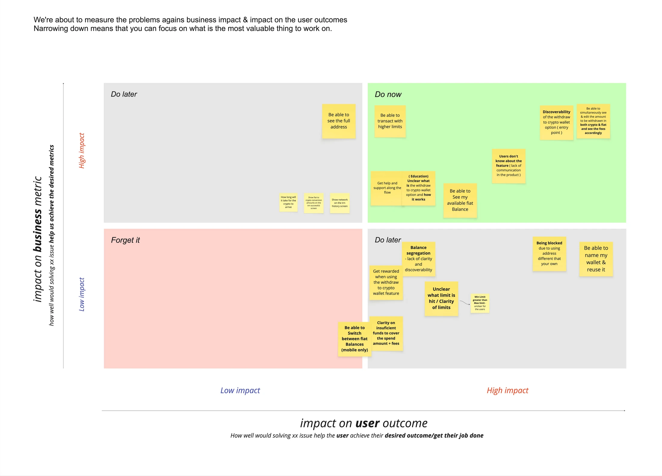
Naming the problems produced 16 distinct items – from "users don't know about the feature" through "unclear what limit is hit" and "clarity on insufficient funds to cover amount + fees", to "get help and support along the flow" and "get rewarded when using the withdrawals".

Every problem plotted on impact on the business metric against impact on the user outcome, with the goal and metrics from workshop one pinned physically at the top of the frame as the yardstick. Nobody had to argue from taste.
Then a second pass: how easy is it to build, splitting the high-impact items into quick wins and big bets. The effort axis is what turns a wish-list into a plan.
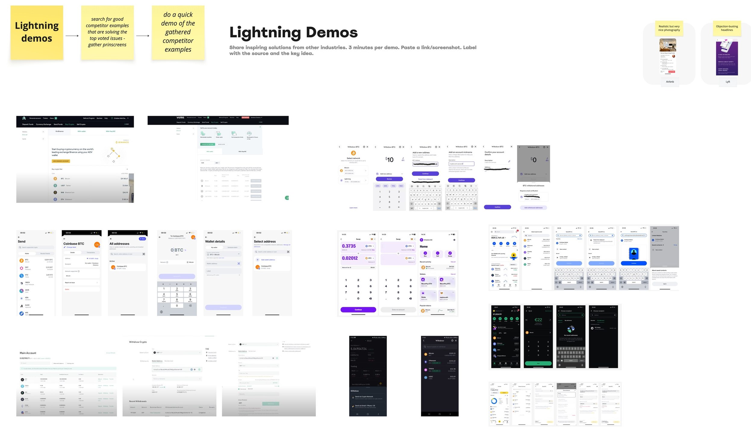
The ideation workshop ran on a tight agenda: five minutes of intro, then six How Might We rounds of five minutes each, a vote, a rest – then fifteen minutes of lightning demos of competitor solutions to the top-voted problems.
Each top-voted problem was reframed as a question – rephrasing a problem as a question is what switches a room from panic into solution mode. The three that carried the session: how might we help users know about the feature in the product? How might we educate users on what the withdraw-to-crypto-wallet option is and how to use it? How might we help users get help and support along the flow?
Silent, timeboxed idea generation against each question. Quantity first; judgement later, by vote. Against discoverability: a notification centre and push notifications linked to it, iconography that reads dollar-sign to crypto to wallet, and reaching users where they already are. Against comprehension: a custom card on the crypto dashboard with an entry point, the same on the home screen, educational screens. Against support: an entry to FAQ, help and support along the flow behind an information icon, improved FAQ articles, and checking the current journey on the virtual assistant.

Competitor walk-throughs against the top-voted problems – how exchanges and onramps handle withdrawal flows, naming, limits and network choices. Participants brought their own findings; the demos grounded the ideas in what the market already teaches users to expect.
Surviving ideas were written up as hypothesis statements – we believe that doing this, for this user, will achieve this outcome, and we will know it is true when we see this – with the assumptions behind each collected for testing. This step exists because of the pre-mortem: no untested hypothesis ships.

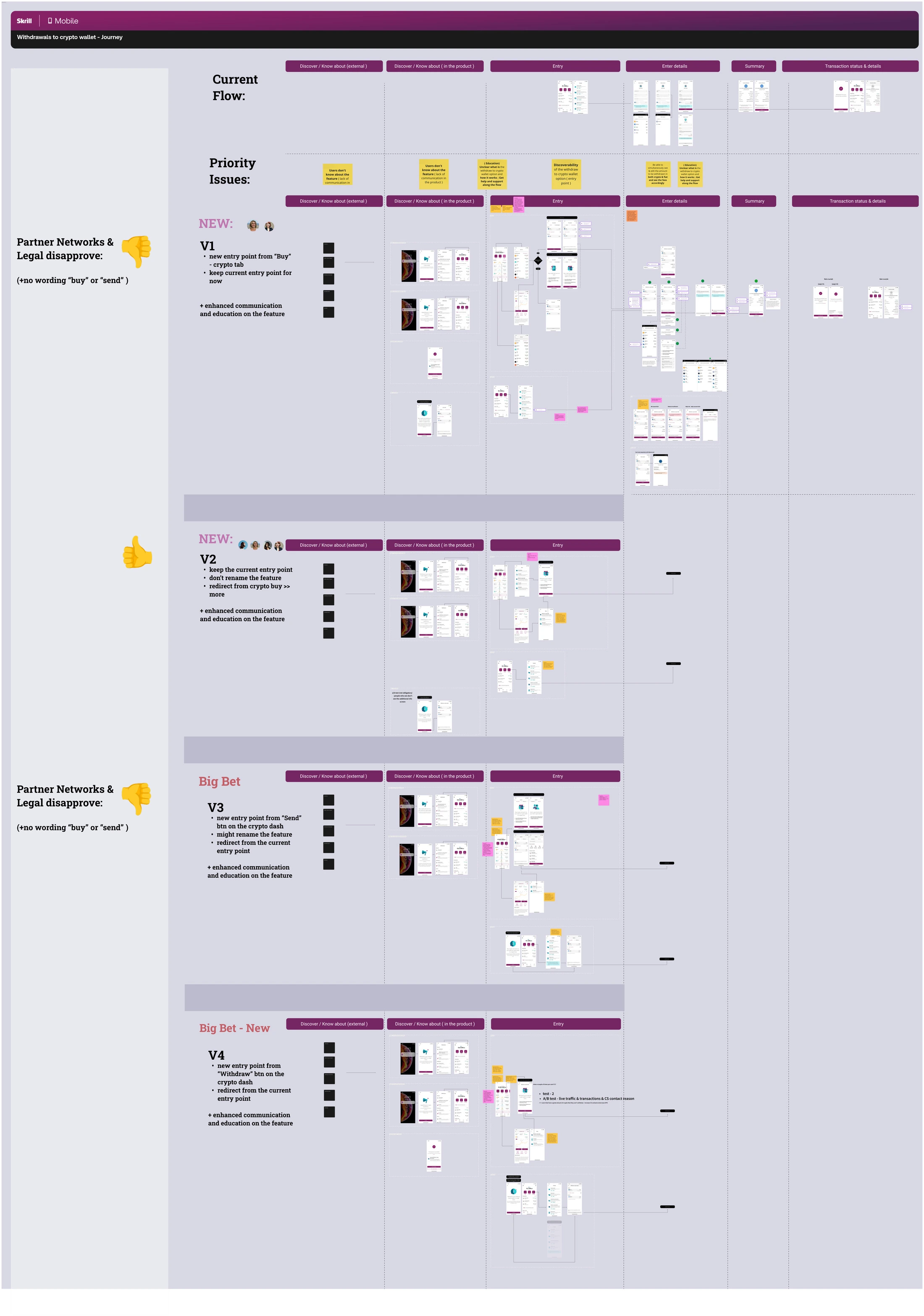
The winning directions became three concrete variants of the journey for app and web – new entry points and reworked steps – taken through design review with design, product and engineering, each carrying its own approval status.
This is where the hardest constraint showed itself. Two of the three variants leaned on renaming the feature or introducing clearer wording, and both were disapproved by partner networks and legal: no "buy" or "send" in the naming. The variant that survived kept the current entry point and the existing name, and won discoverability another way – redirecting from crypto buy, plus a new entry point and much stronger communication and education around the feature. Working inside a constraint you cannot argue with is a large part of what this project actually was.
The proposed flows and entry points were usability-tested on app against the hypotheses written during Develop – every task paired with the metric it was meant to move and how it would be measured, then scored per participant. That closes the loop the pre-mortem demanded: no untested hypothesis ships.
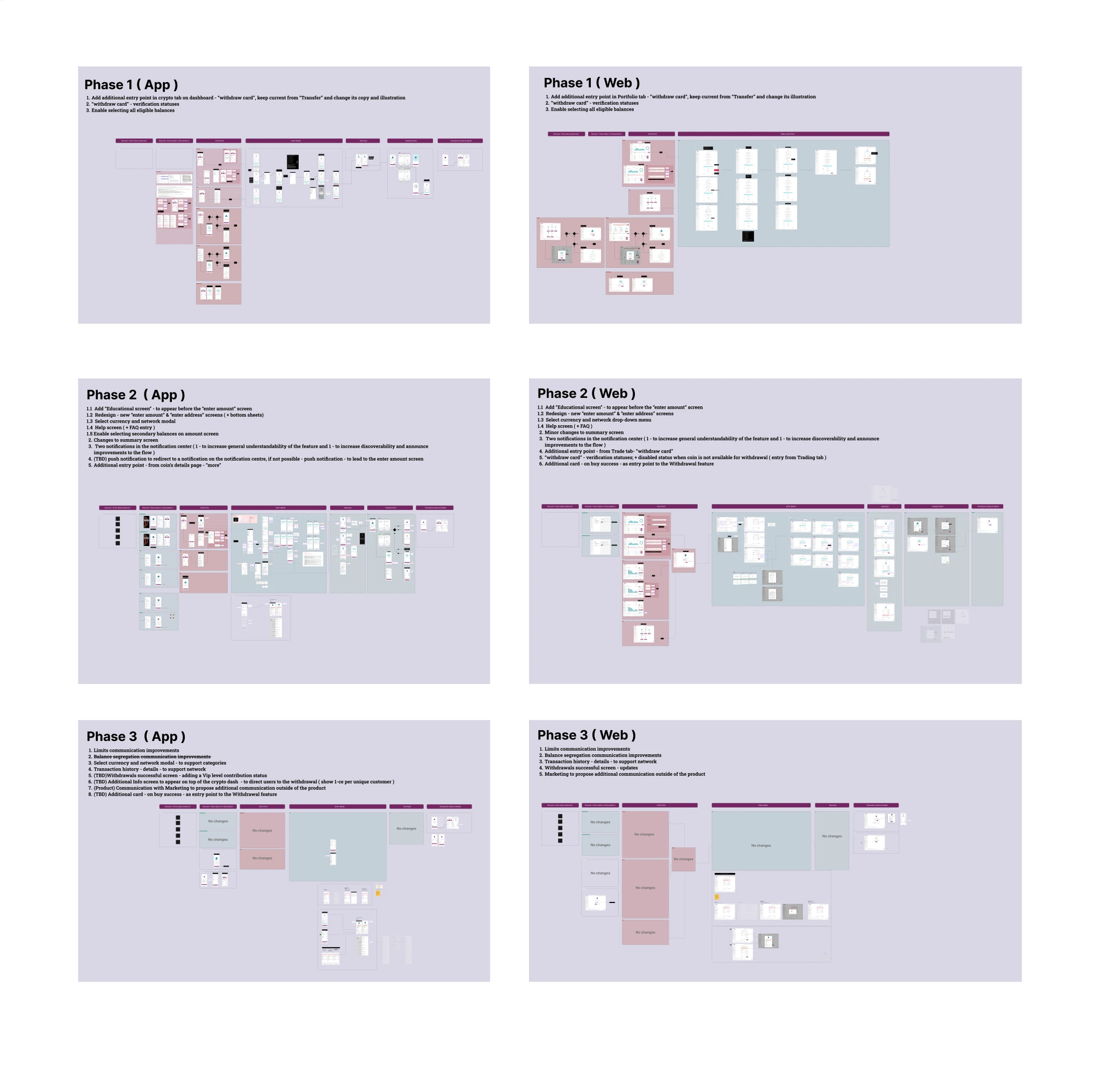
I worked with product and engineering on prioritising which features and flow improvements entered development first, weighing the impact on users and the business against the development effort each required. As a result the work was divided into three stages of development, each a complete, shippable slice for both app and web rather than a partial release.

The redesign increased first-page landings on the "enter amount" step by 25% in a quarter, and monthly withdrawal volume grew from 10K to 15K transactions per month.
Beyond the numbers, the initiative changed how the problem was understood. It began as "fix the drop-off in the flow" and ended with much greater understanding of the "why" behind the number, plus clear evidence that discoverability and clarity along the journey are equally harmful for business metrics.
Stakeholders and engineering managers highly appreciated the collaborative approach, which often eased their decision-making and saved time.
It was a lot to run in the time available, and next time I would look at cutting down some of the workshop exercises to fit the constraints more comfortably. Where there is capacity, the project would also benefit from a second designer or researcher joining for the research activities, to increase efficiency further.
Two case studies sit close to this one – the same conviction that alignment comes before execution, applied with different instruments.