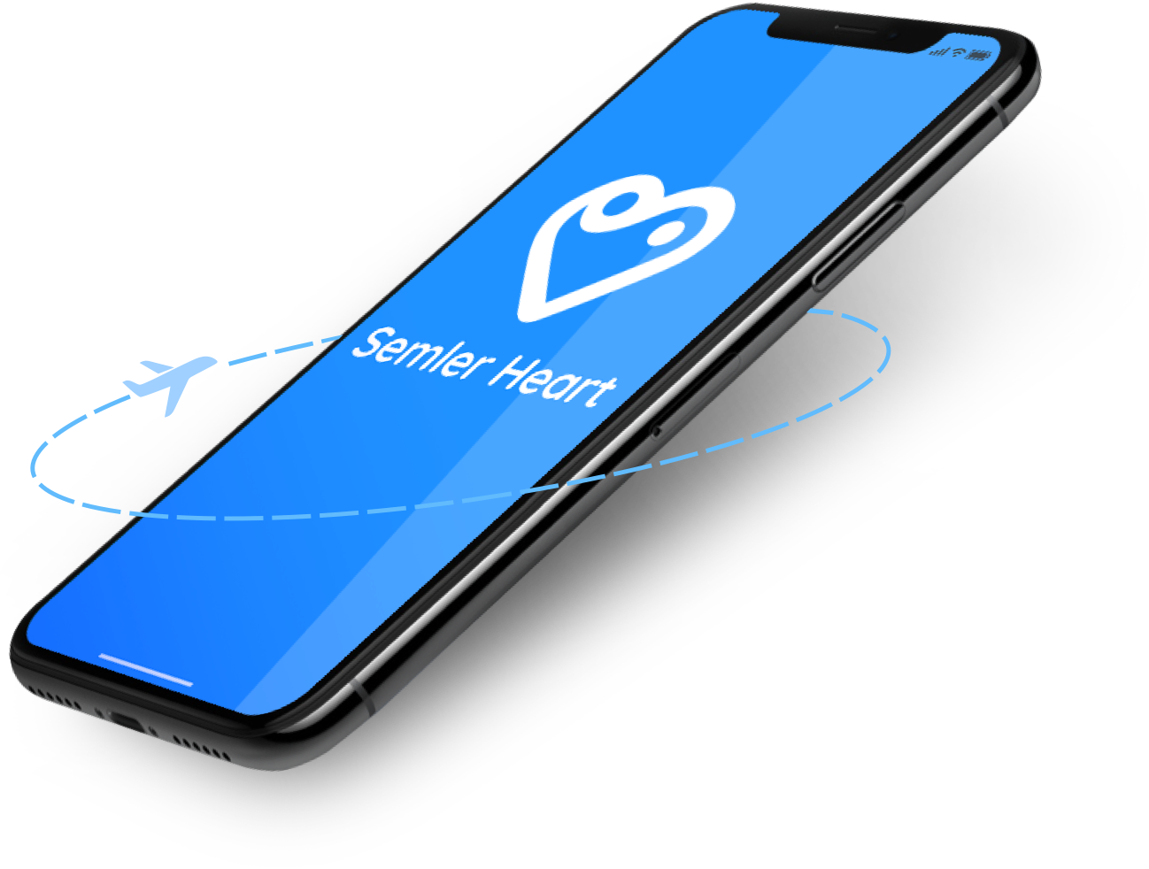
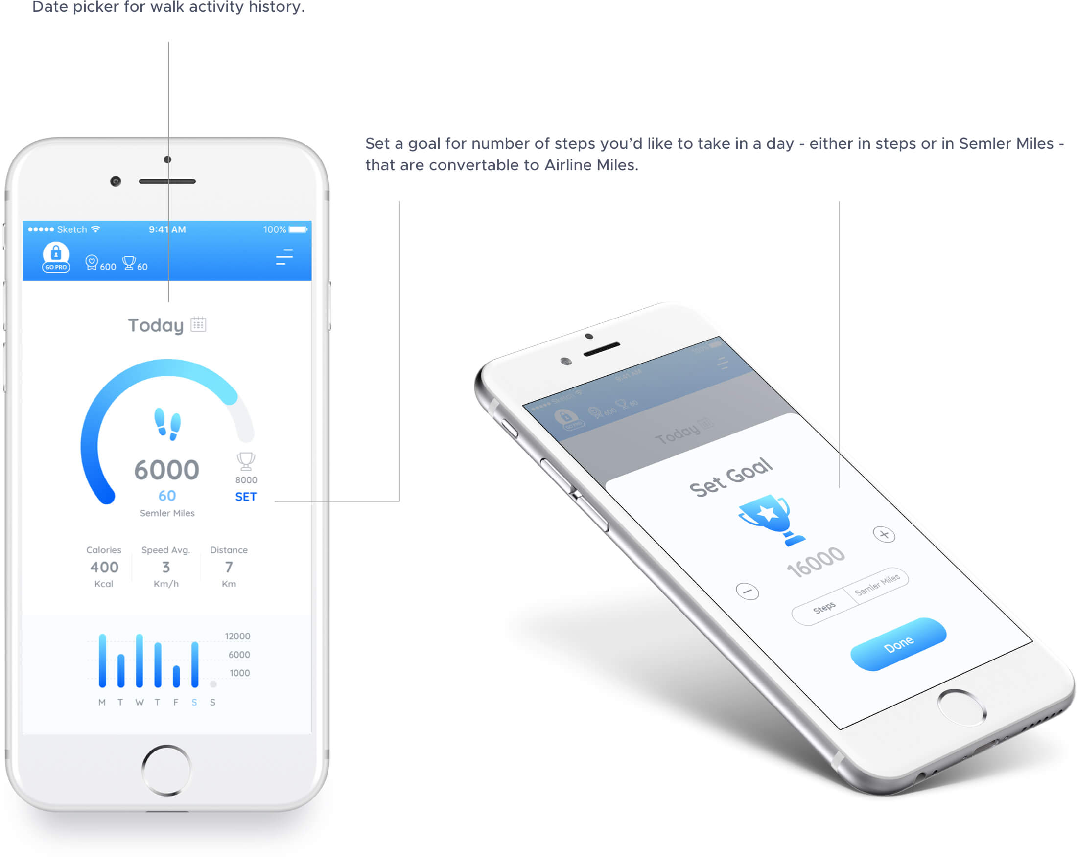
Semler Heart App is an app promoting healthy lifestyle by rewarding you for being active. Studies show that walking at least 30 minutes each day will improve your health. You receive many benefits from apps that track your steps but Semler Heart App is the only one that rewards you! One Semler Mile (2000 steps) rewards you one airline mile, up to 100 airline miles per month!The creator of the Semler Heart app is the world renowned Cardiologist Dr. Herbert Semler.
Dr. Semler’s team had previously created an app- pedometer which provided healthy advice, but they were looking for more effective ways of changing customers behaviour and building a different product/experience - through “rewarding” healthy behaviour. My role included a complete rebranding, or more precisely building the brand from the grounds up - including identity and logo design; also app visual design, UX (together with the development team),UI ,prototyping; desktop portal and landing page. I worked tightly with the development team, discussing Ux and technical matters with them, also handing off design assets and style guides. After the launch I also did a mini QA and reported to the team if there were any issues to be fixed.

The customer was on a tight timeline, so they did not need me to do user interviews, scenarios and user journeys to identify user needs and goals/jobs to be done, so we internally constructed the app’s structure and user-flows after some research and competitor analysis.
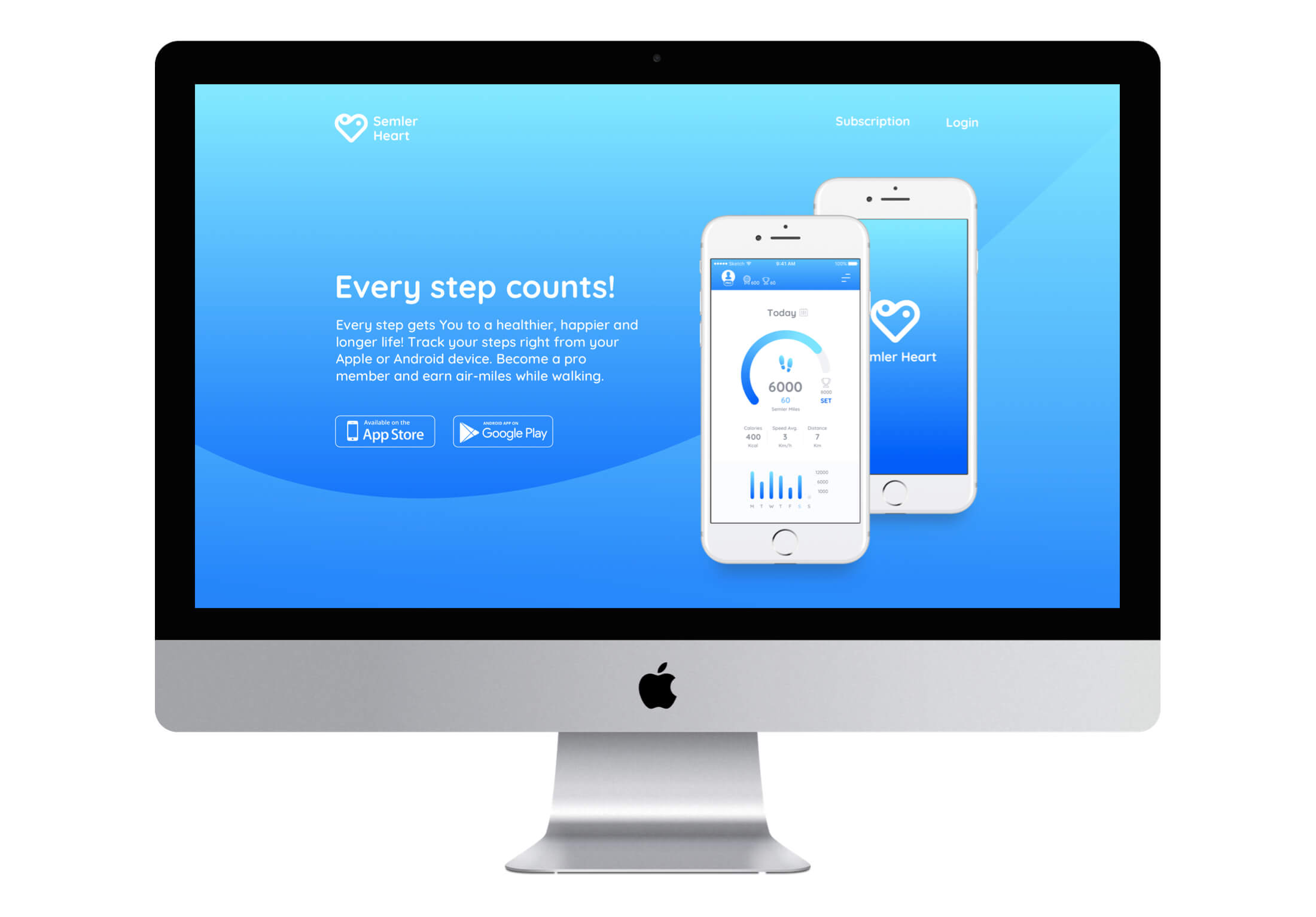
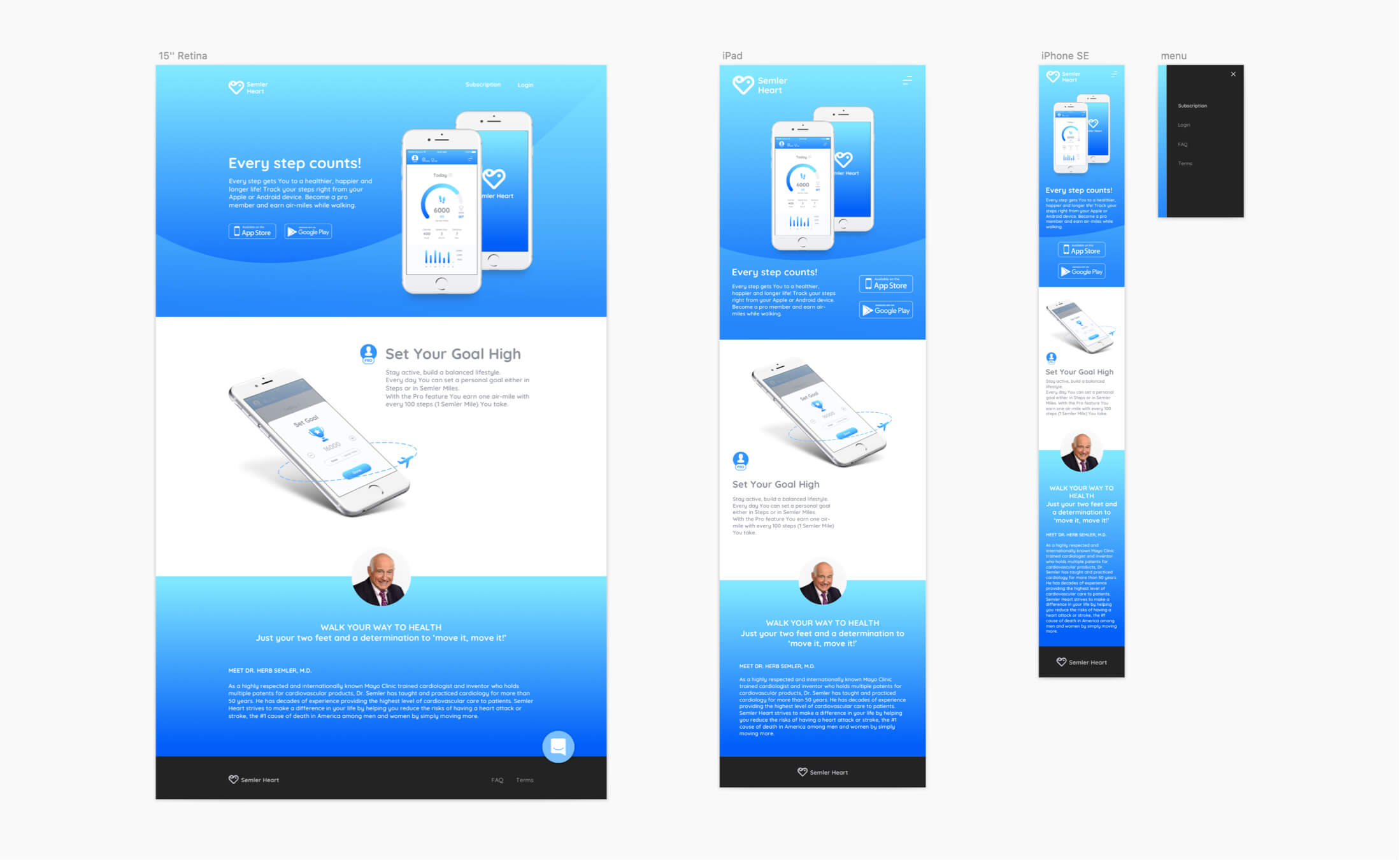
For the first phase of the project a landing page was needed to draw attention towards the app and its unique benefits.I did responsive design for the app landing page and also proposed the structure and some copywriting.
In Phase 2 of the project (second release) the app’s main focus shifted towards rewarding the user for being active by monetising their walk activity through earning Airline miles while walking (the client felt that this was not emphasised enough in the app). In accordance with the client’s marketing team I came up with proposal that would communicate better the rewarding aspect and would serve the customer’s goal to motivate more people to get moving (measured by acquiring more premium subscribers).
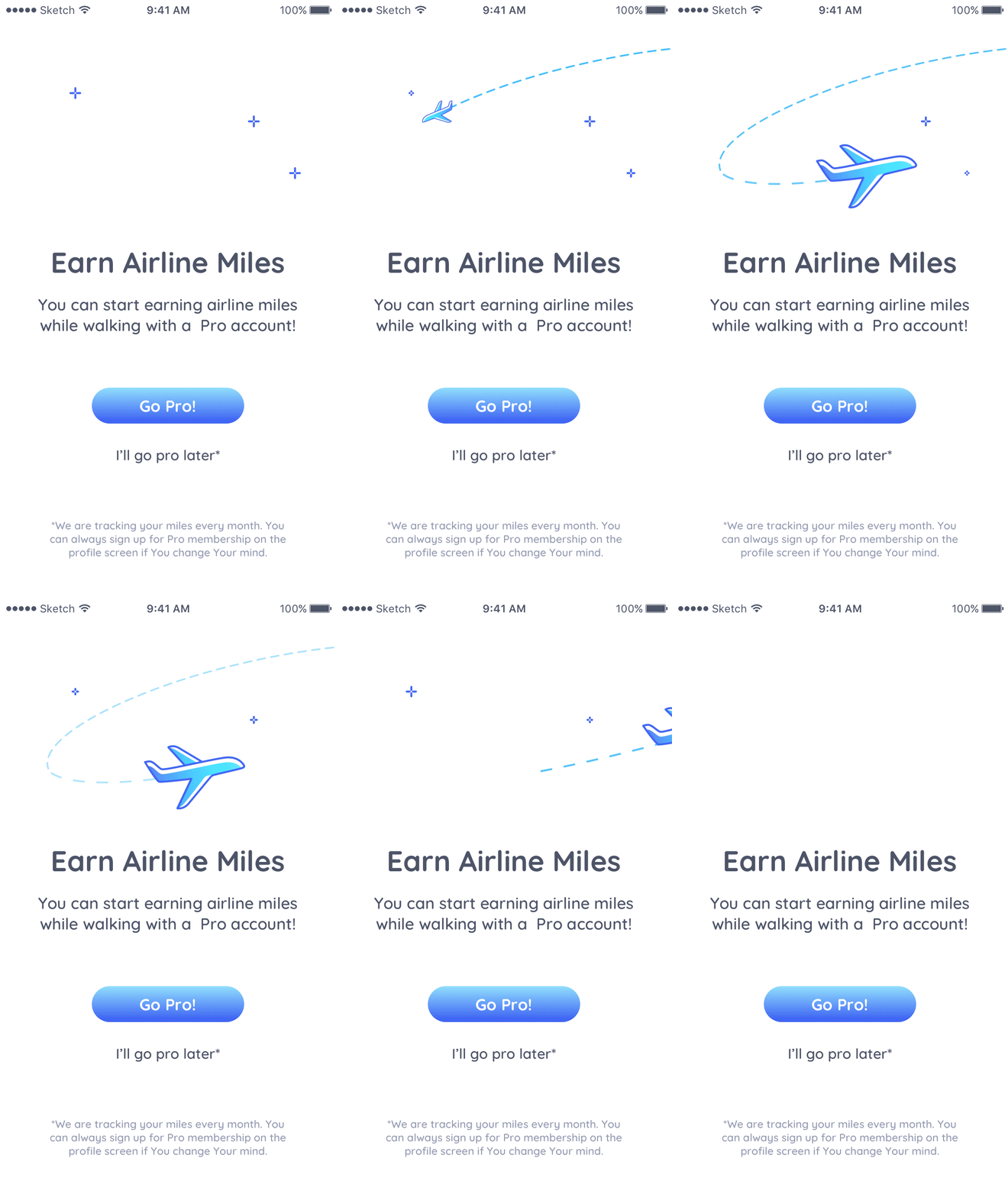
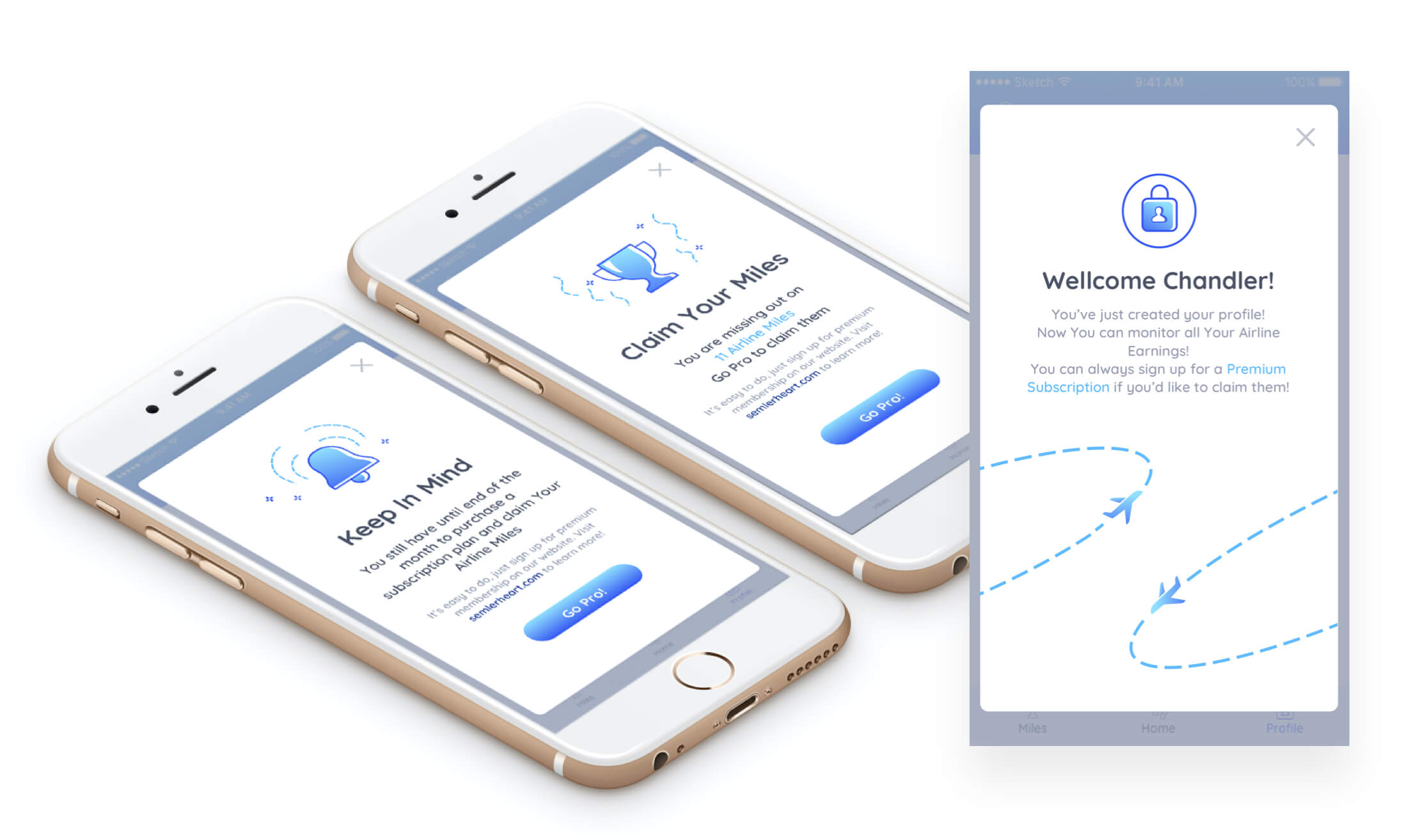
"Additional optional purchase screen" - (also suggested by the team), positioned before entering the main app. If the user is not fascinated by the idea of adopting healthy routines but would involve in such based on rewards - then why not give them that chance straight away. (This screen might be in conflict with the "try before buy principle" though.) Animated illustration is used to trigger the users's association or representation of a flight before making a decision (priming). (On the technical side - I made the animation for this screen in AE+ Bodymovin x Lottie.)
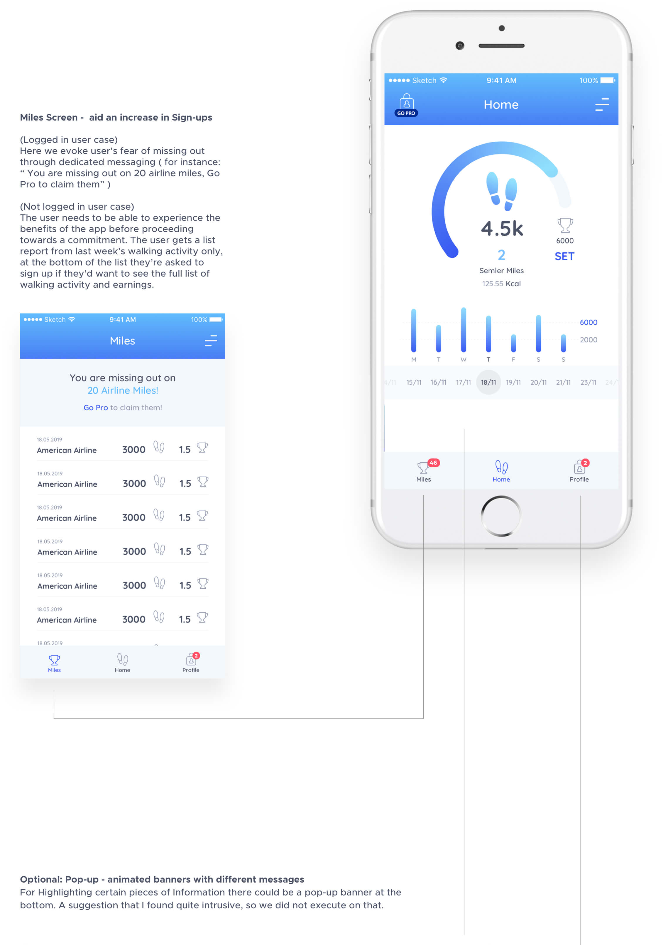
Adding a tab bar - for improved navigation and additional features evoking purchase. Many apps use the bottom navigation for the most important app’s features. In our case - it is to inform, motivate and reward users. Frequently-used actions are at the bottom of the screen, because they are comfortably reached with one-thumb interactions - having a diversity of larger-screen mobile devices is also making the bottom part of the device the most commonly used area. Users are also accustomed to completing automatically certain tasks - such as checking their notifications ( we’ re also incorporating this approach in the tab bar). The “miles indication icons” that were previously at upper left corner are converted to section “Miles” where users can monitor their walk activity amounting to airline miles and monitor their earnings.
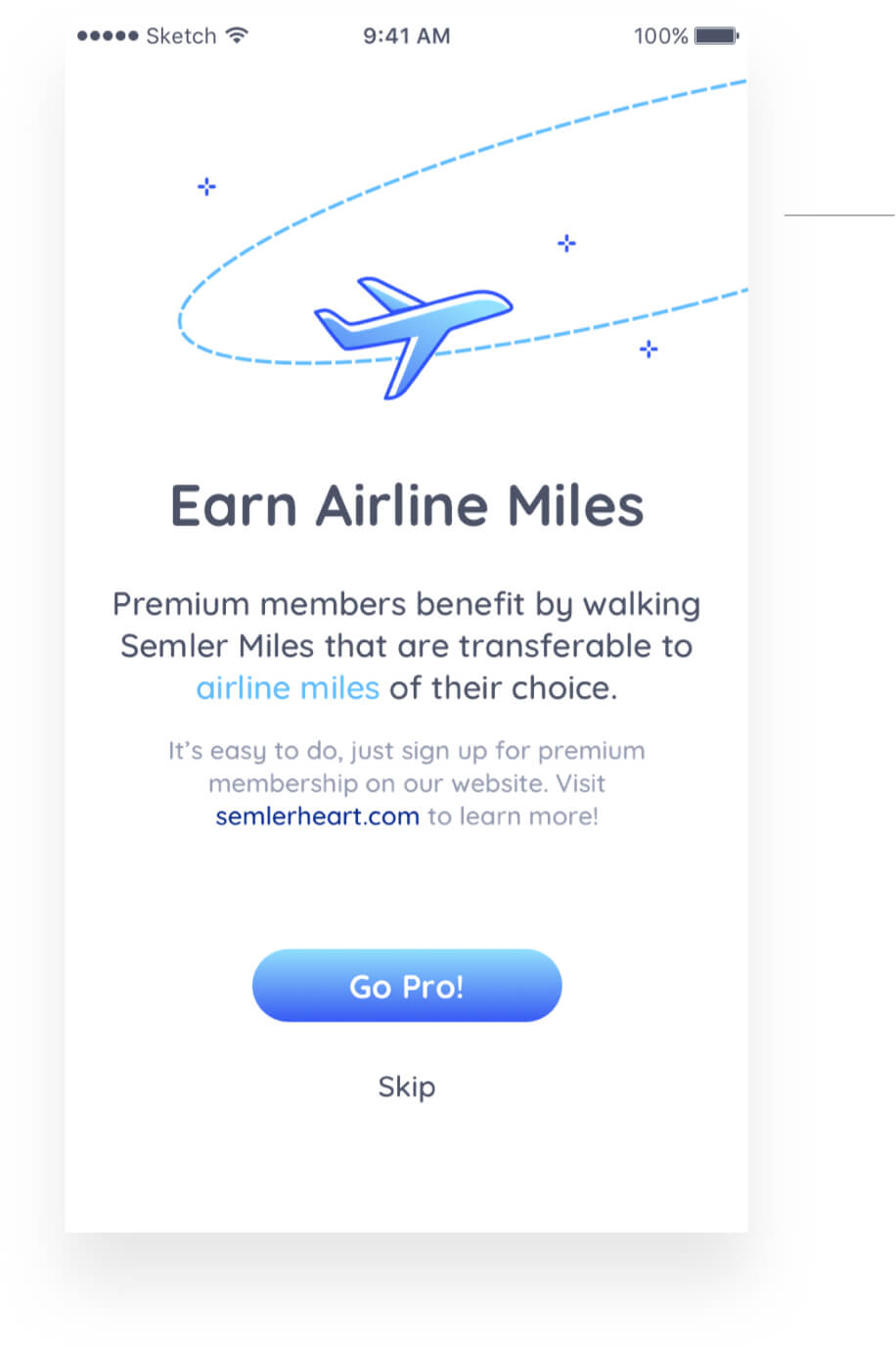

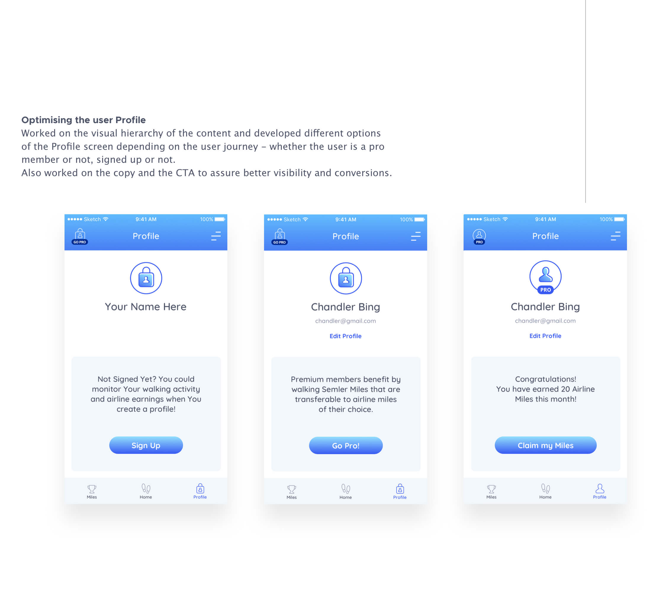
Pop-Ups and Notifications for better conversion
Designed to help conversions and inform the users of the benefits of becoming
a Pro Member and start converting the miles You’ve walked into airline miles. Having the CTA buttons “Go Pro” would assure better visibility and conversion.
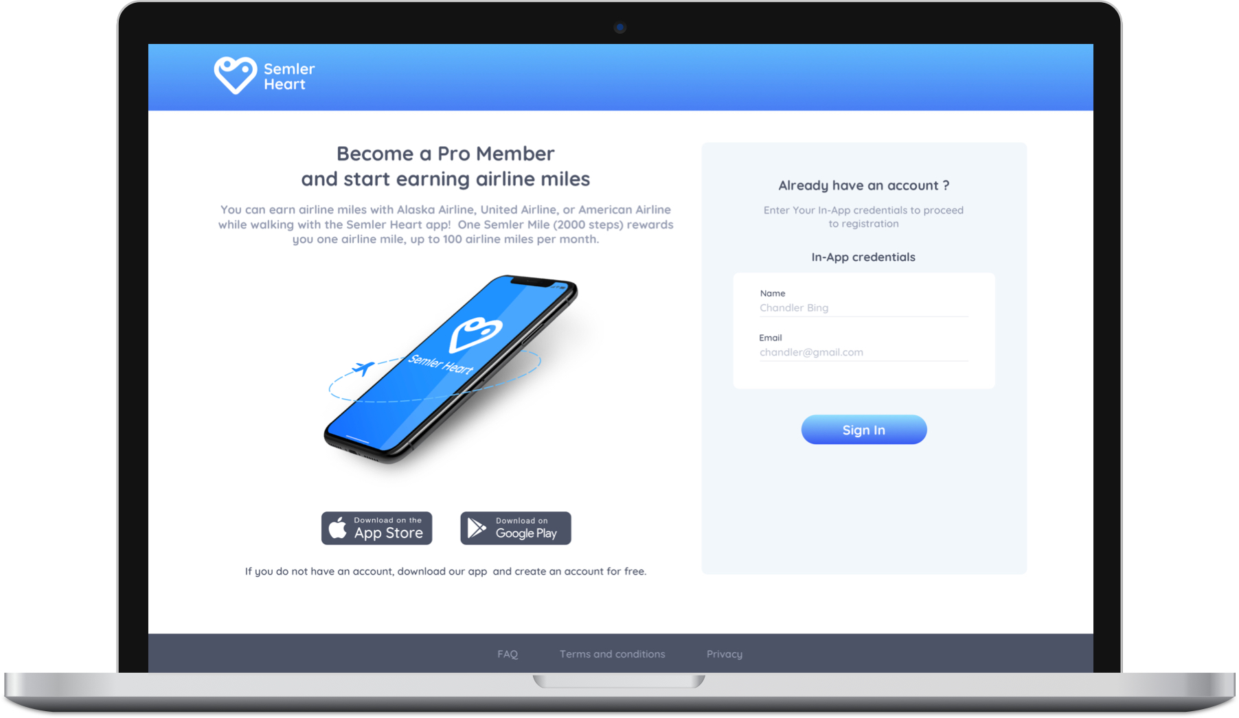
In the second phase of the project we also built a web portal that was connected with the app.There members can go "Pro" by making a monthly subscription.When they do that, it unlocks a special "page" in the desktop version so they can add their Alaska or United airline mileage plan number.When they add their mileage plan number, they can earn one air-mile with every 100 steps they take in the app.
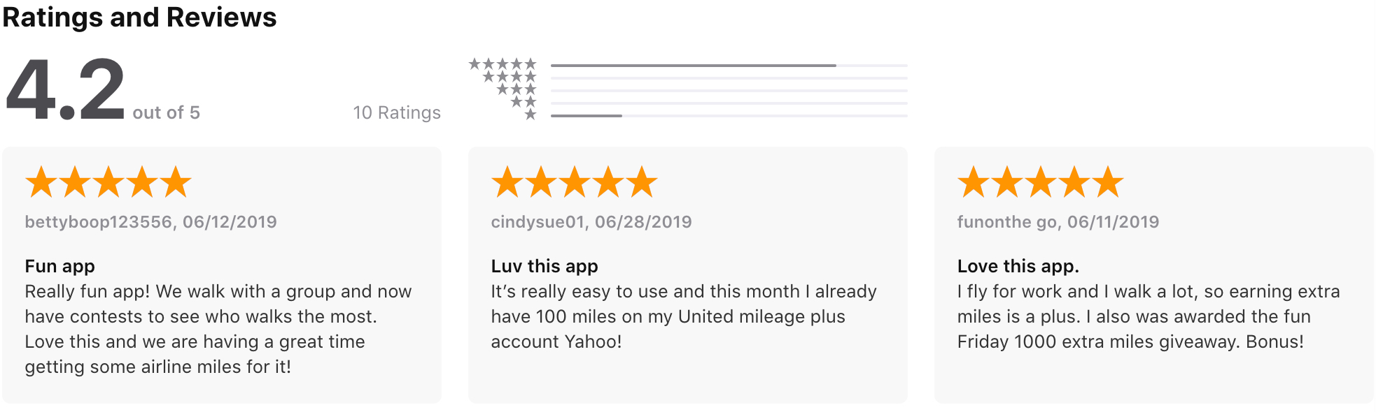
App store ratings and reviews at the app's launch.