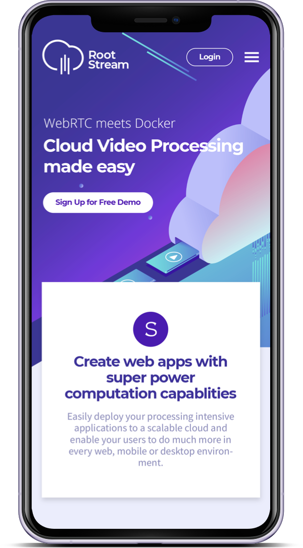
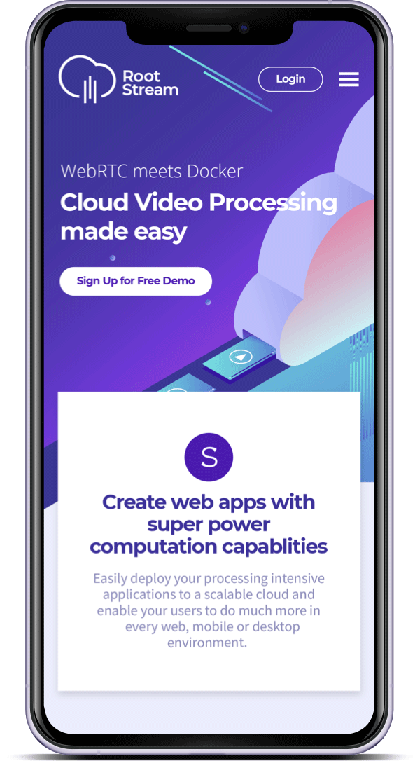
Rootstream's creators were frustrated by all the complexity and costs involved in developing streaming application and wanted to present to the market a platform that would improve this process through its easy-to-use web based API. RootStream is a WebRTC and Docker Cloud Video Processing platform. The platform makes it easy to securely stream any data from connected devices for analytics, AR cloud, machine learning (ML), and other processing heavy tasks to the cloud.
Rootstream is an innovative product that does not have an analogue on the market so I spent some time researching and exploring products in simmilar fields and discussing initial business goals with the team. I proposed a landing page structure, wireframe and some copywriting - allowing the potential users to get a sense of what they can achieve with the product and how it can benefit their business and balance their workload. Also prioritised STA actions according to customer’s and business owners' needs. The structure can be enriched in the future with social proof section, product demo section, usecases etc.
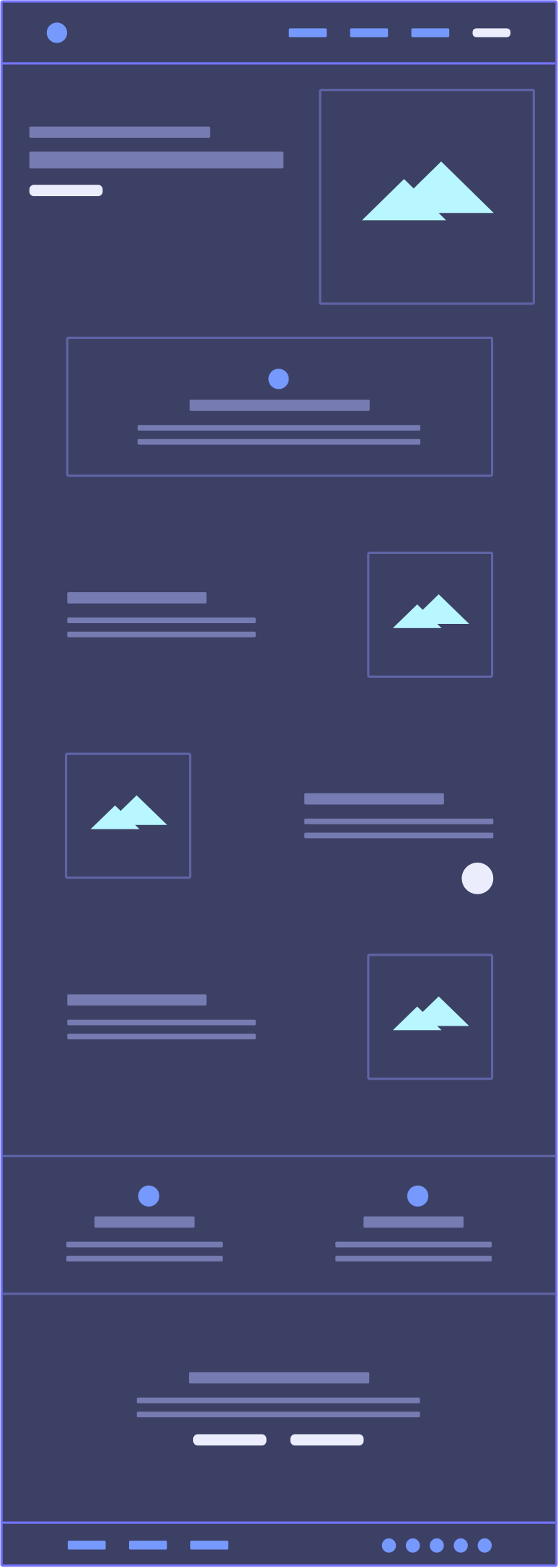
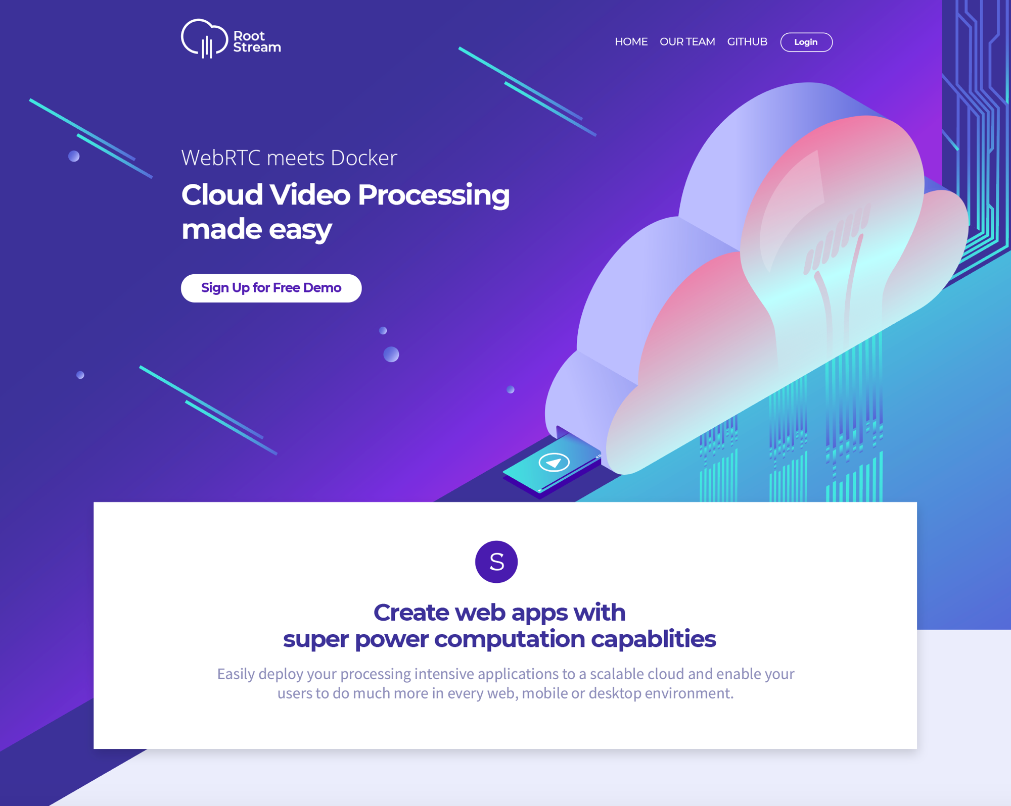
01. Navigation and Login fast access
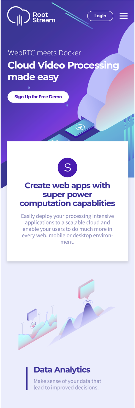
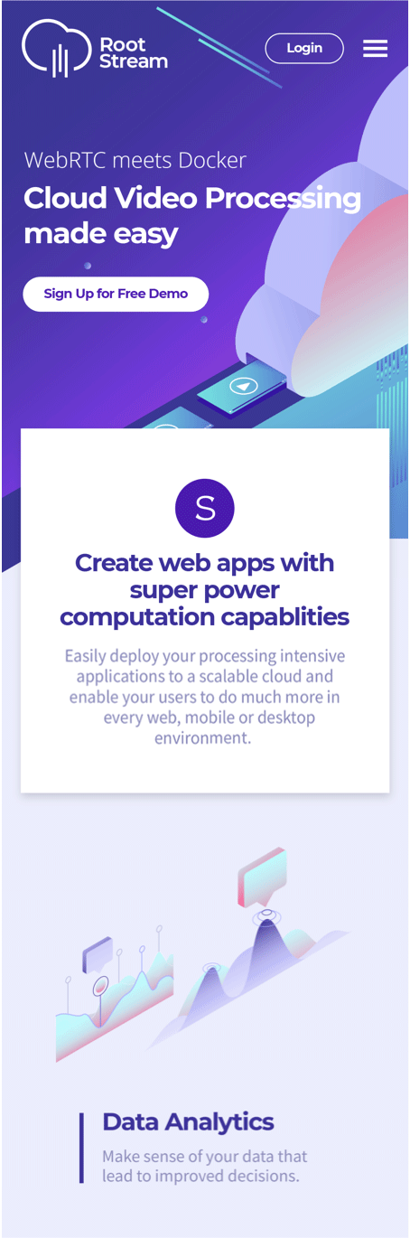
02. Hero section. A "What we do and how can we help You" statement - in one sentence. Main STA - “Try the demo”. Animated illustration to represent what we do at the background.
03. A paragraph on - what makes our product special and how it will improve your processes.
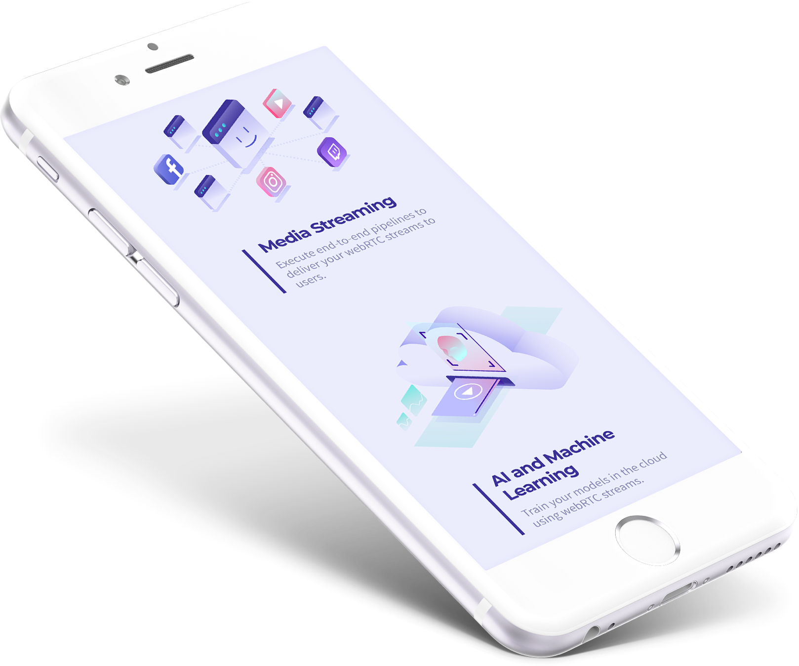
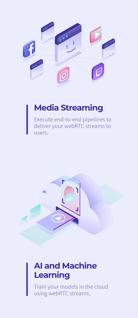
04. Main features and how they bring value to the customers. Animated illustrations to visually describe the usecases.
05. A chatbot (sticky position)
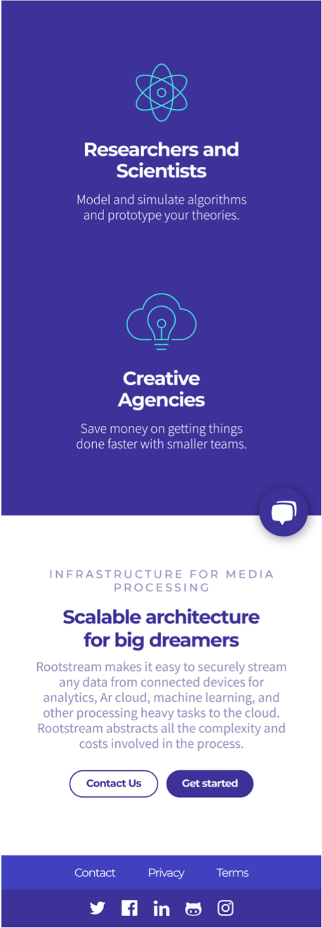
06. Who’s it for? Recognizing the target groups and main benefits for each target group.
07. Why You should try out the product. STA - main: “Try the demo” , secondary :”Contact us”
08. Why You should try out the product. STA - main: “Try the demo” , secondary :”Contact us”
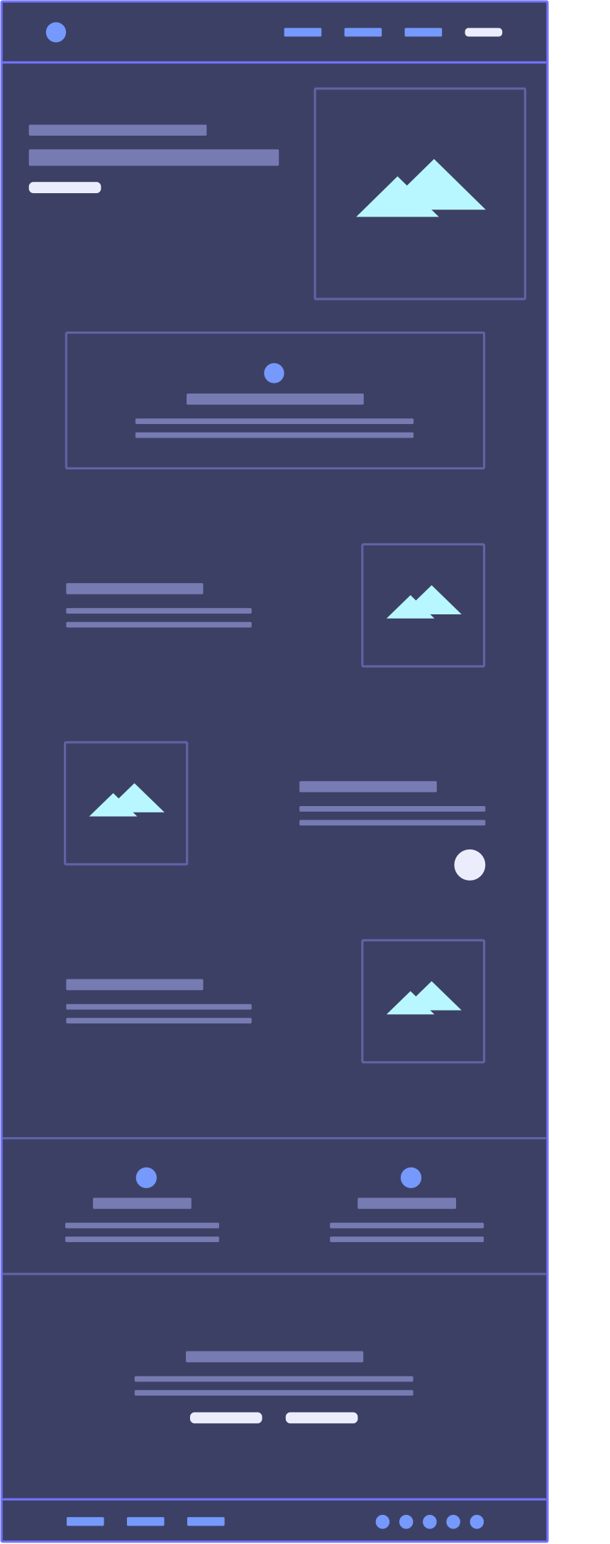
01. Navigation and Login fast access
02. Hero section. A "What we do and how can we help You" statement - in one sentence. Main STA - “Try the demo”. Animated illustration to represent what we do at the background.
03. A paragraph on - what makes our product special and how it will improve your processes.
04. Main features and how they bring value to the customers. Animated illustrations to visually describe the usecases.
05. A chatbot (sticky position)
06. Who’s it for? Recognizing the target groups and main benefits for each target group.
07. Why You should try out the product. STA - main: “Try the demo” , secondary :”Contact us”
08. Why You should try out the product. STA - main: “Try the demo” , secondary :”Contact us”
To represent the product features and benefits I had close sessions with the product owners. I was doing my best to visually convey the key aspects of the product and to translate the technical specifications into tangible product features, leading to measurable benefits for customers. I Looked into customer pain points in relation to media processing and how Rootstream would improve this process by abstracting all the complexity and costs involved in developing streaming applications.
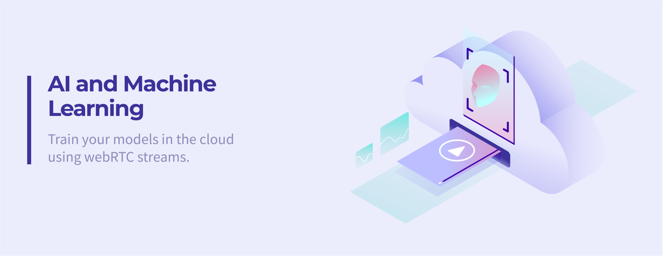
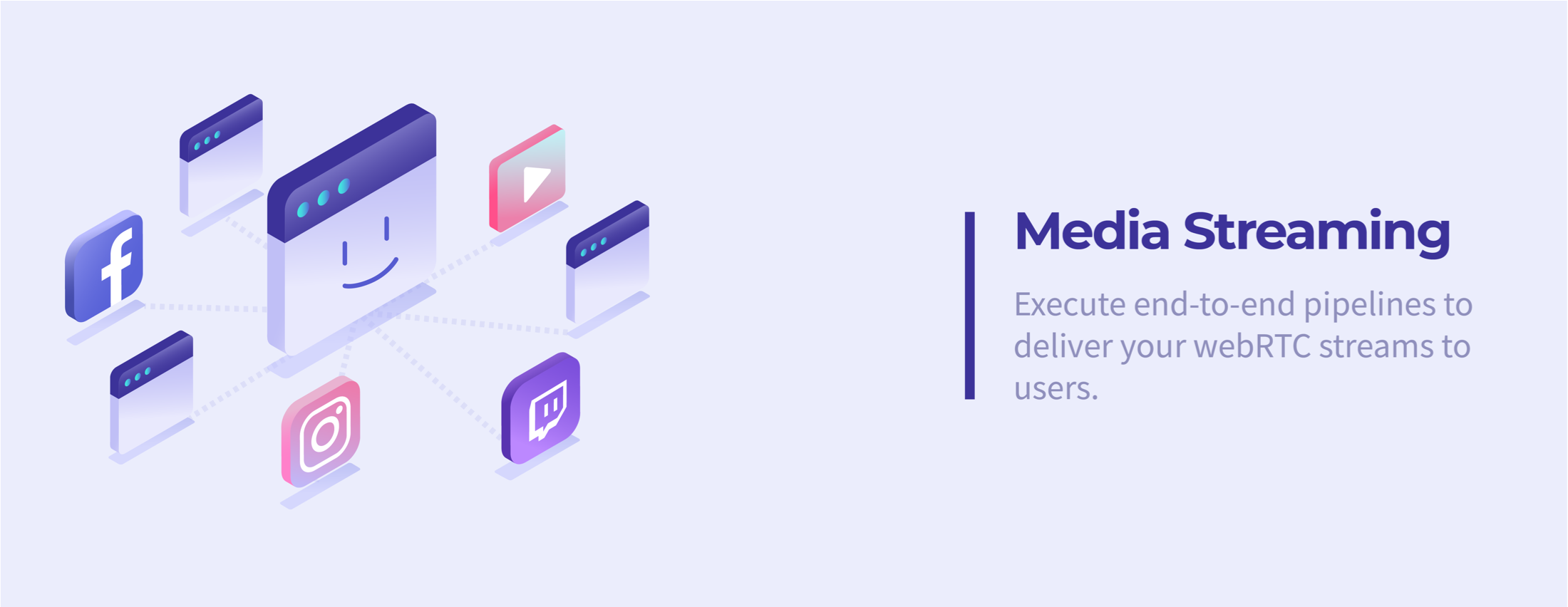
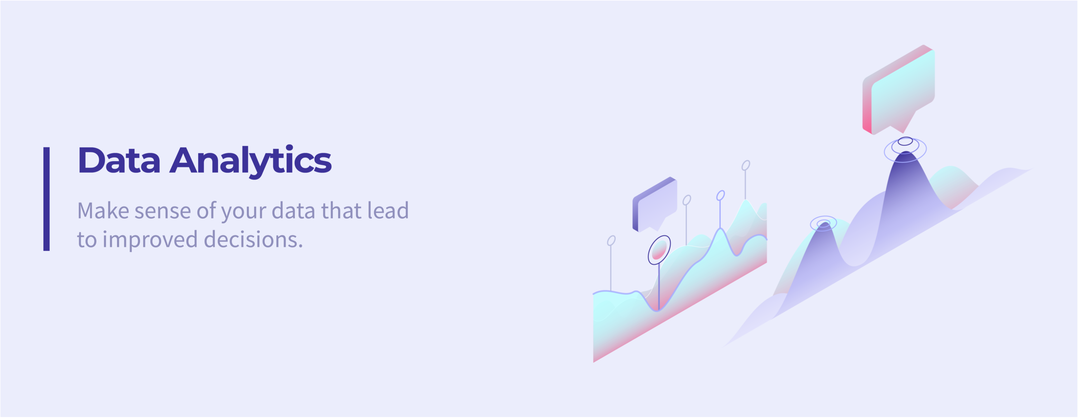
I created animated product features illustrations to better tell the product story. Animation played the role of a narrator to better represent the actual usecases of the product. All the animations were created on Adobe Animate and Edge Animate and integrated directly into the landing page as html, css, JS, so that they would allow fast webpage loading.
primary colors
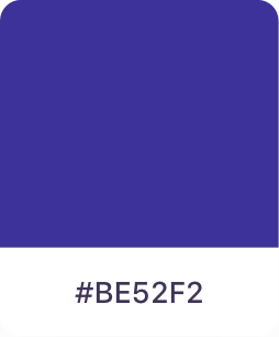

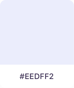
primary colors
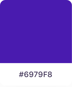


accent color

Gradients
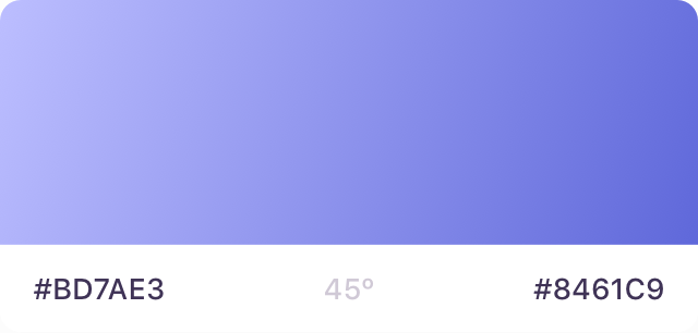
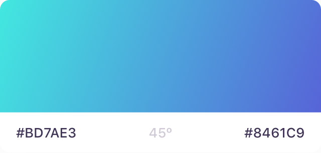
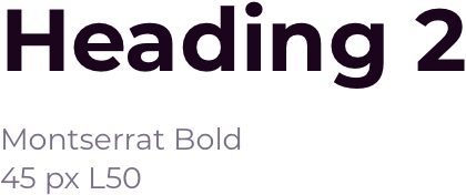
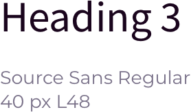
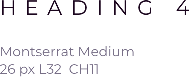
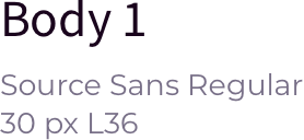
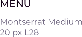
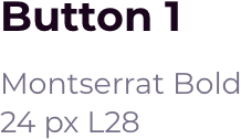
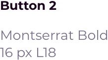
typography desktop

The team already had some sketches of the logo, so I gave it a finishing look and made sure that is suitable for different display sizes and that it is coherent with the rest of the iconography I've created.