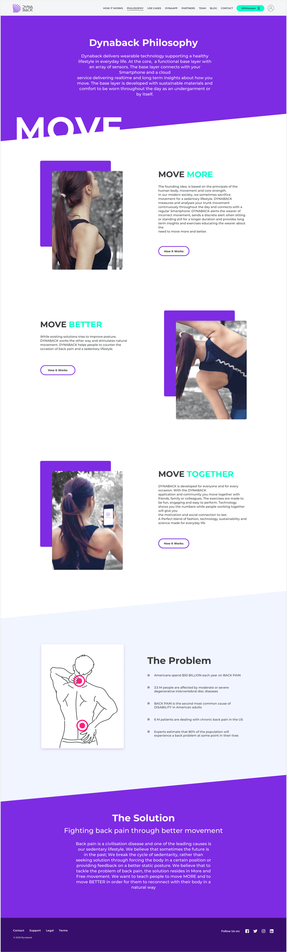
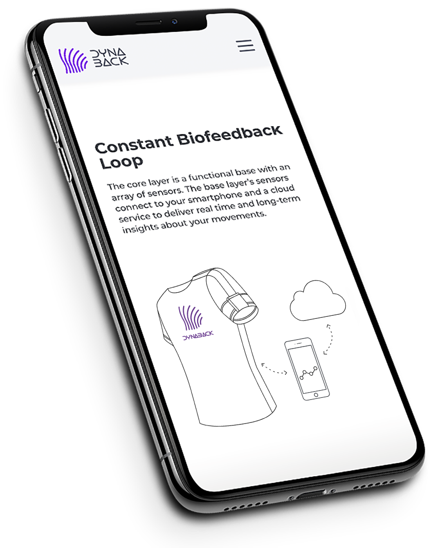
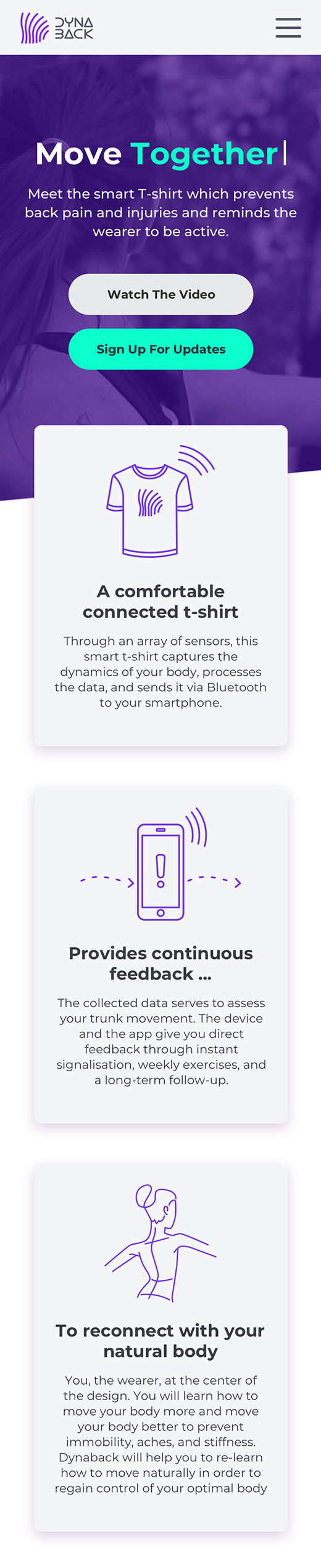
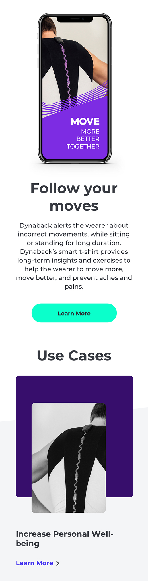
In our modern society, we often sacrifice movement for a sedentary lifestyle. DYNABACK addresses this issue by working on a Smart T-shirt that measures and analyses your trunk movement continuously throughout the day and connects with a regular smartphone to provide realtime and long term insights about how you move. DYNABACK alerts the wearer of incorrect movement, sends a discrete alert when sitting or standing still for a longer duration and provides long term insights and exercises educating the wearer about the need to move more and better.
Dynaback needed a more effective way to communicate to general and specialised public their product benefits, to showcase what core value it presents to the users and that it gives a unique solution to a major problem. Also to build a solid and trustworthy brand in front of potential investors.
What I proposed as part of the solution to Dynaback’s challenge was designing their website in a way that would clearly talk to each target group and give individual solutions to the different user groups’s problems. The website had to communicate the main product benefits to the users clearly, frictionlessly and fast. I’ve also worked on the brand identity to harmonise with their products’s unique characteristics and ideology.
The process kicked off with client sessions and extended to research of areas such as wearable technology, smart-wear, spinal injuries, sports and rehabilitation (also including examining competitive websites).
Clarifying business goals goes hand in hand with clarifying users needs.
I went trough identifying the target users’ pain points and ideating on how to showcase the way the product addresses them. In Dynaback’s case those are literally pain points - back pain and injuries due to sedentary lifestyle, irregular posture and irregular movements, lack of knowledge and motivation to acquire and utilise regular posture habits, lack of efficient, longterm and reliable ways to cope with that problem.
Then comes the question - how does the product generate more value than competing ones?
Dynaback, compared to other solutions on the market focuses on movement and the dynamic position of the spine. While others see the problem of the sedentary societies as static, Dynaback takes the problem upside down- being still and sitting is not natural thus causing the problem.
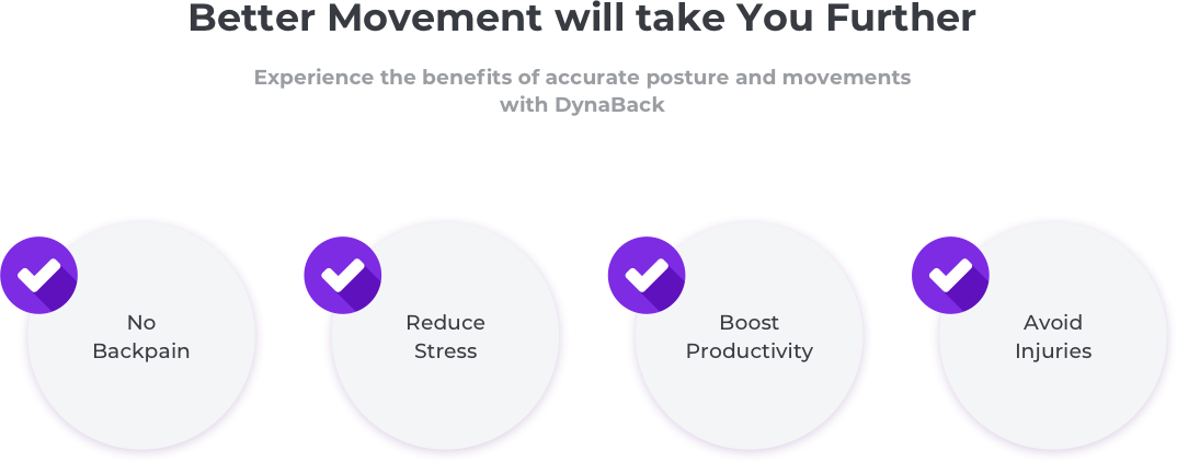
- Mass consumer (suffers from back pain and spinal disorders)
- Niche consumer - work health and safety in manually handling of loads
- Niche consumer - safety and rehabilitation in the field of sports
- Niche consumer - rehabilitation
Having cleared out the website’s information architecture I proceeded to building pages prototypes - starting with low/medium fidelity prototypes and transitioning to high-fidelity after client approval and gathering user feedback. Here I’ve shared some highlights of the content proposals to the client for the homepage. Special attention is paid to serving the different user group’s needs and creating meaningful user flows for each group. Considering what the customer wants out of a particular page, what they may be feeling, what mindset they’re in. I also map out where the calls-to-actions should live and prioritising them according to the business’ needs.
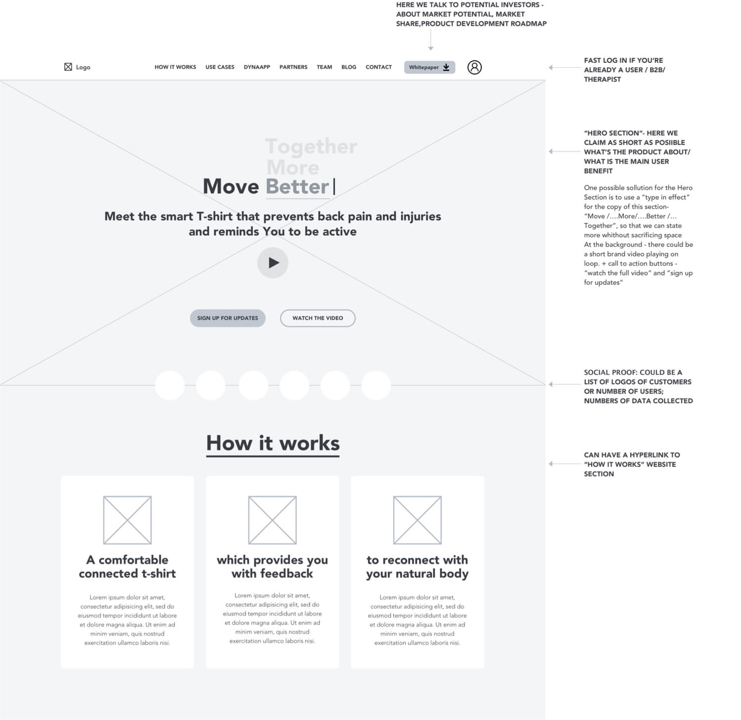
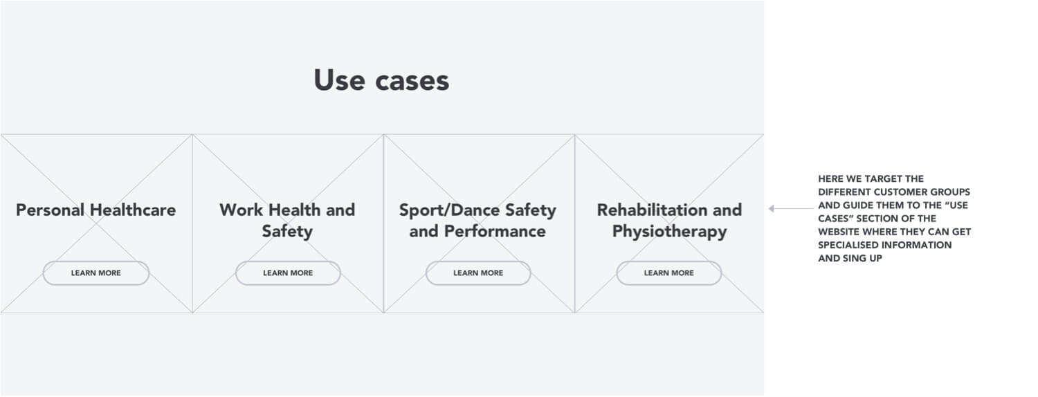
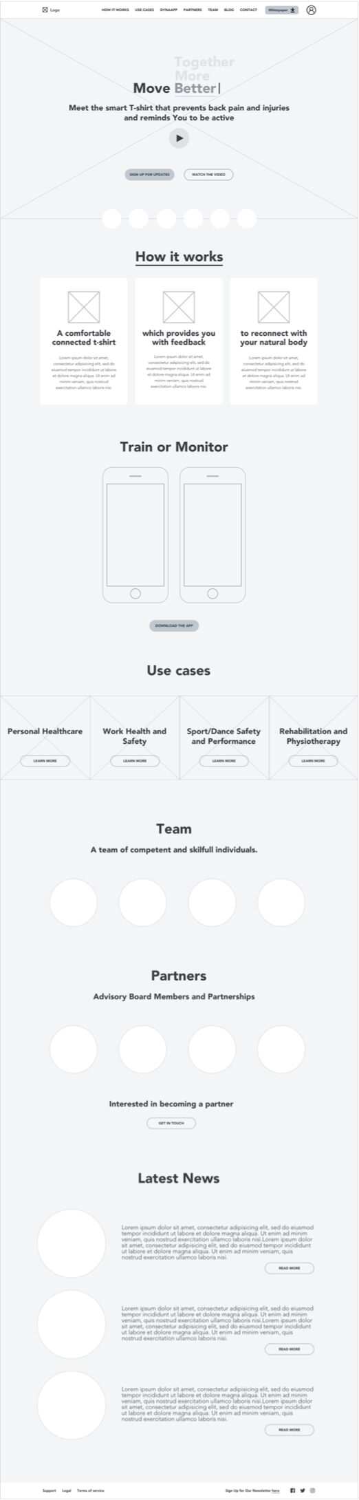
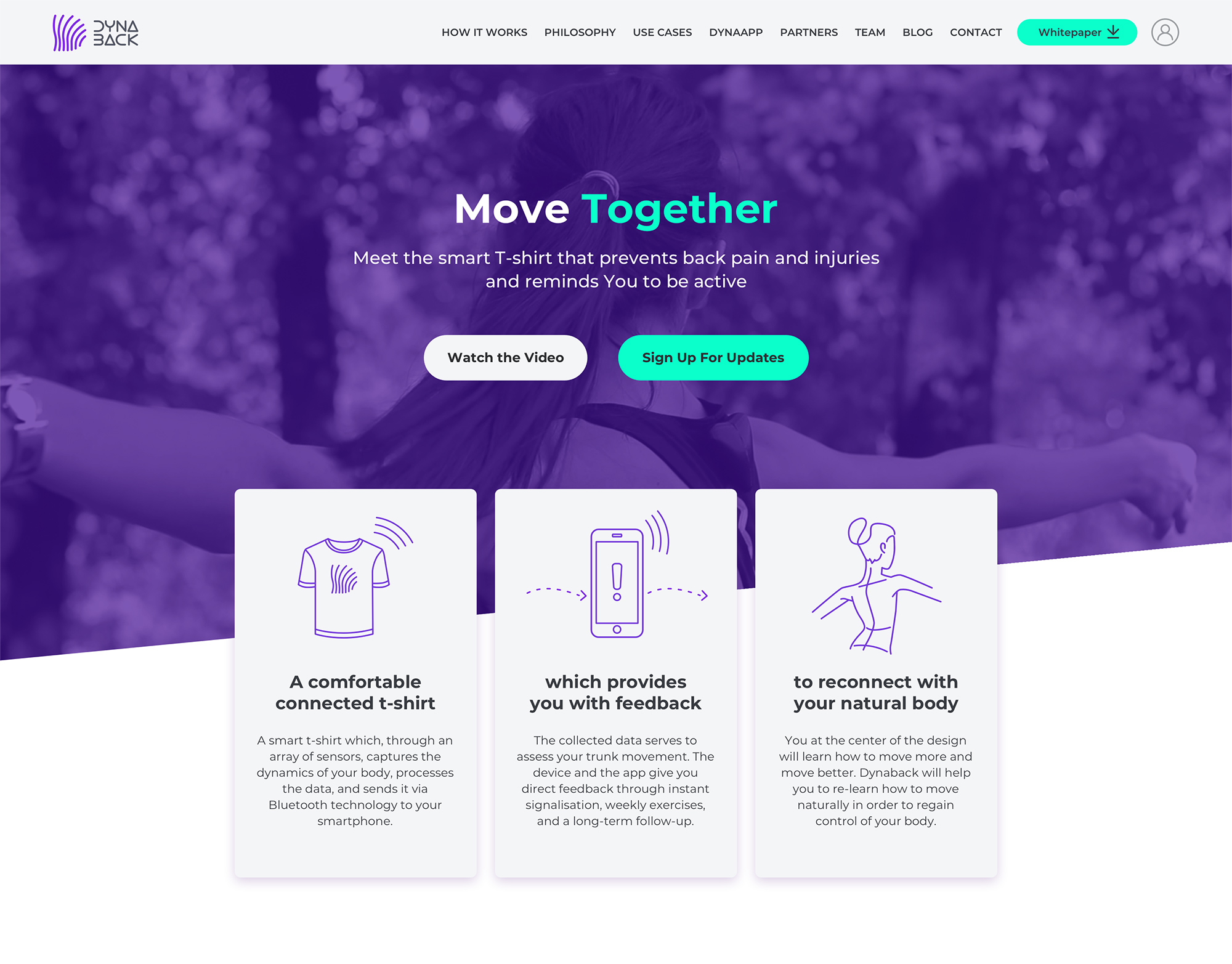
The “How it works” page provides detailed product information, product USP, product benefits and “pain relievers” to answer user’s need of certainty before making a commitment (preordering, subscribing etc.). This page also provides sections with links to "Use Cases" page, where specialised information for each niche user group is provided along with CTA.

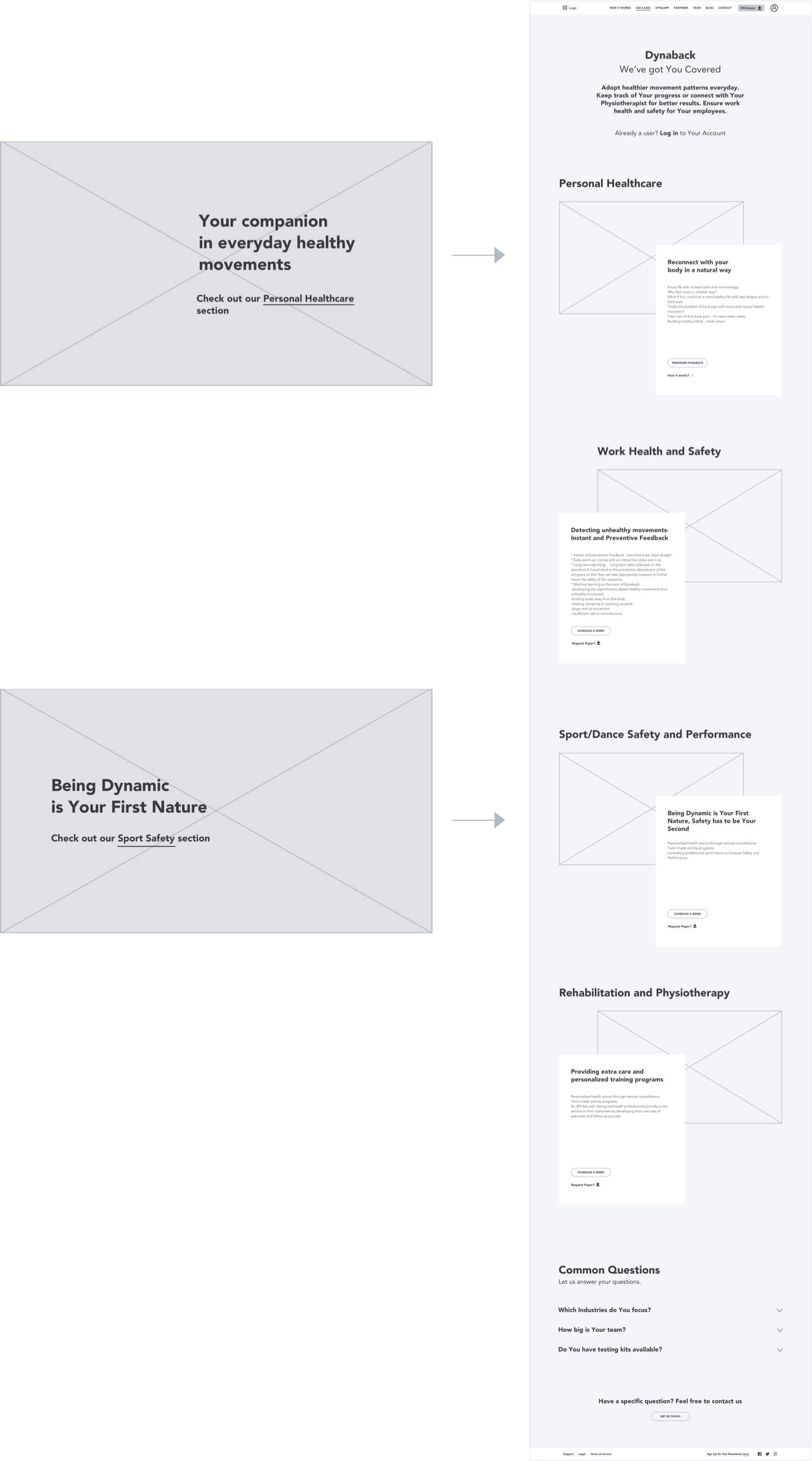
Sharing some of the slogans I’ve worked on for the hero section. They’re built upon what’s unique about the product - observing movement (spine’s dynamic state) to capture the essence of the back-pain problem.
What made the final cut was an improved version of Dynaback's original motto:
MOVE ... (type in effect) ... MORE
MOVE ... (type in effect) ... BETTER
MOVE ... (type in effect) ... TOGETHER
As for the rest of the slogans - some of them came in handy when working on the specific "Use-cases" sections.
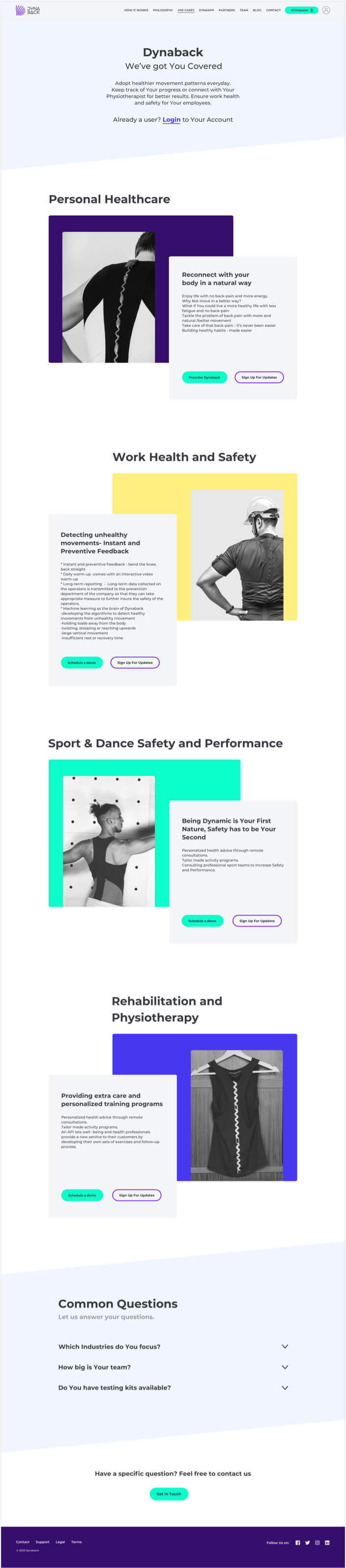

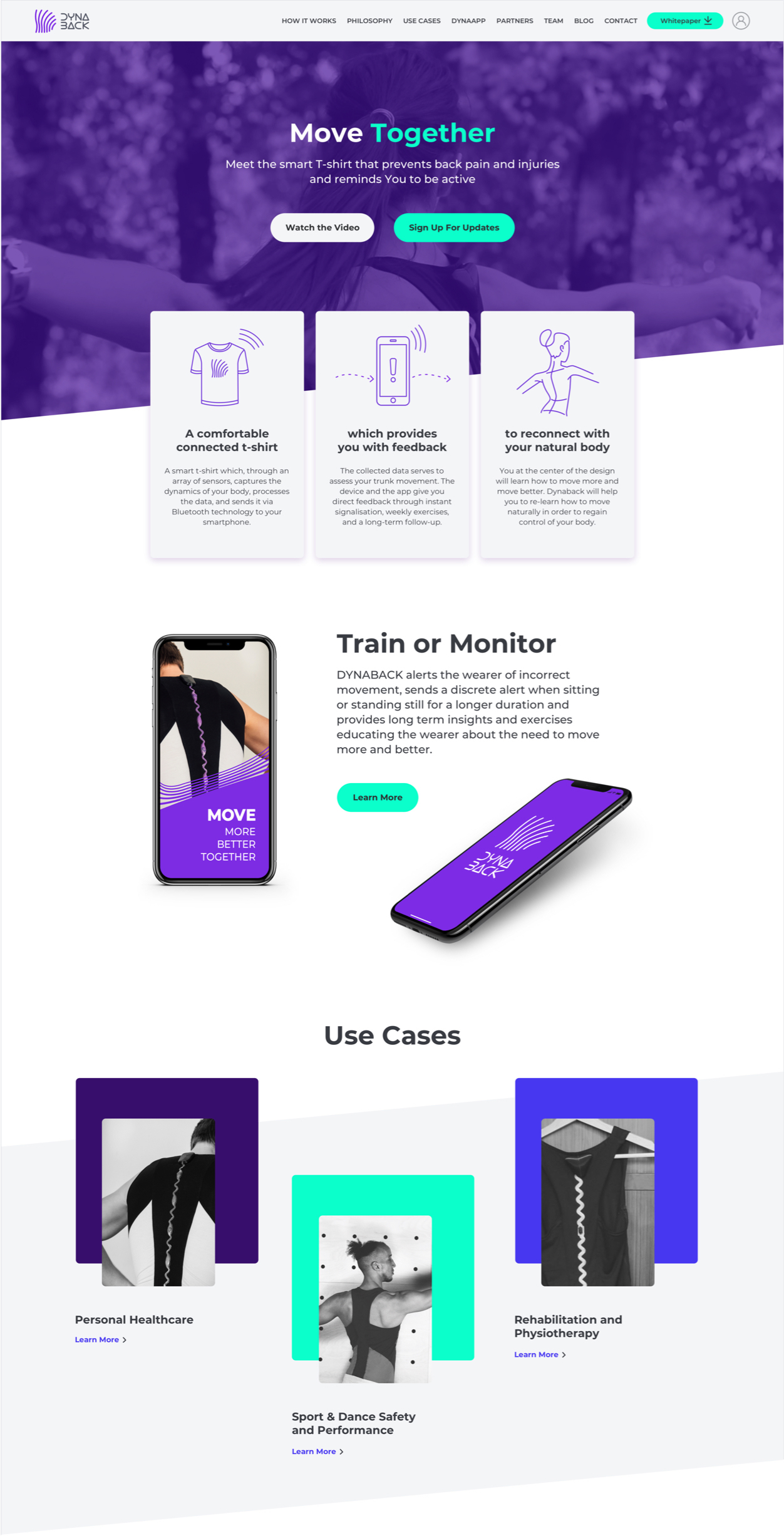
To achieve clear communication and differentiation for the different market segments I’ve introduced a distinct color coding for each target user group.
(Also a dedicated photoshoot is to take place in order to further support each distinct use-case scenario.)
Clear user flows throughout the website also help the users to self-segment and achieve more easily their goals on the website.
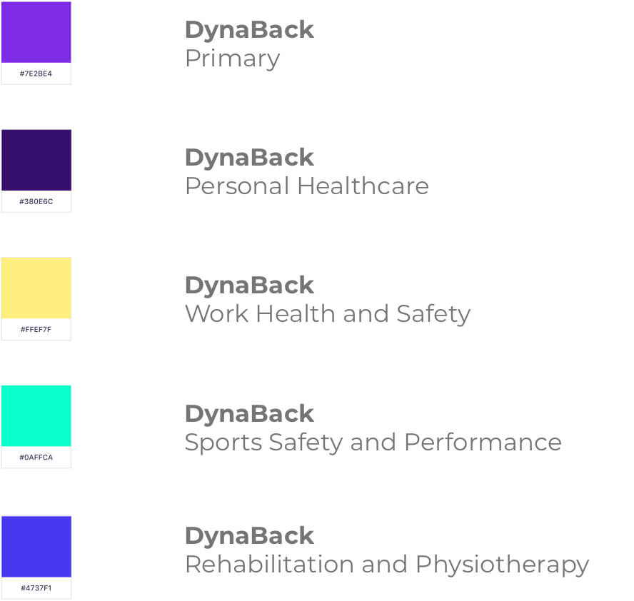



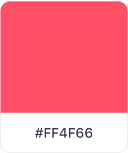
primary color
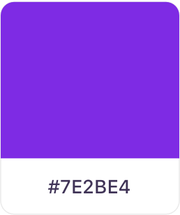
accent color
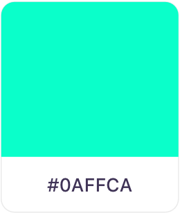
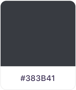
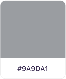
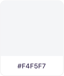
secondary colors
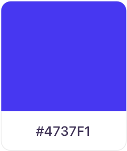
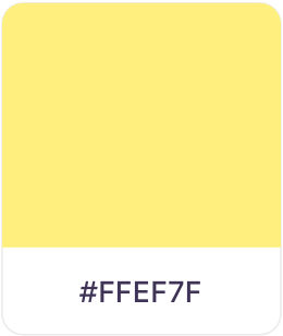
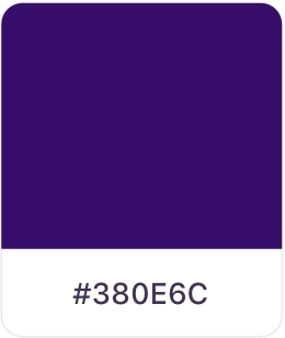
secondary colors - Greys

Error message
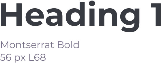
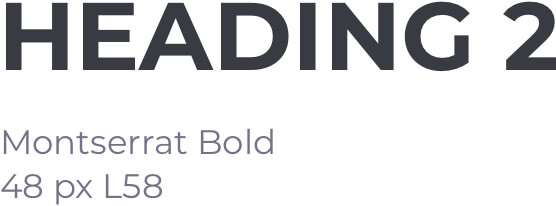
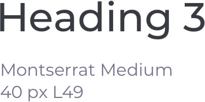
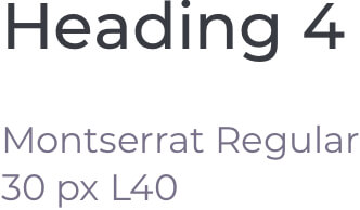
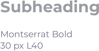
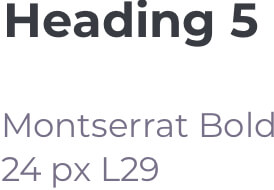
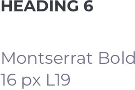
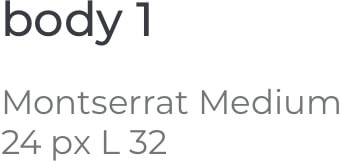
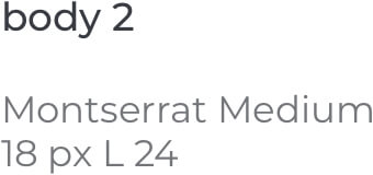
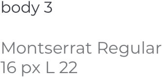
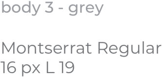
typography desktop
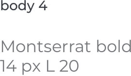
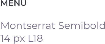
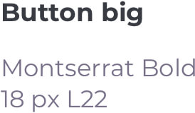
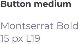
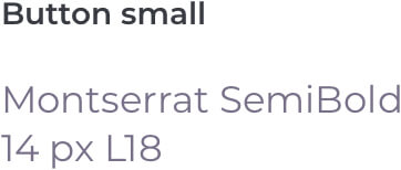
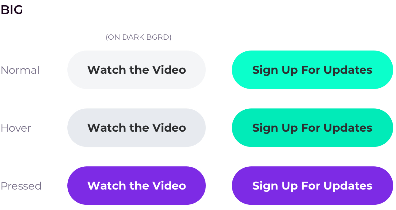
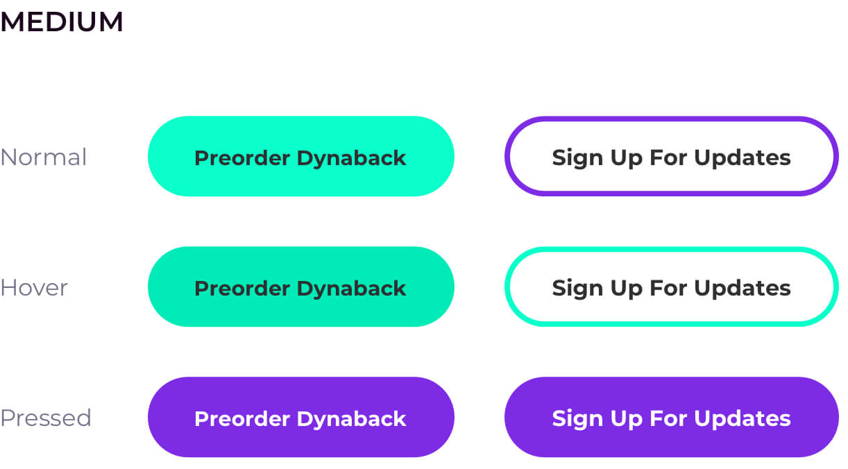
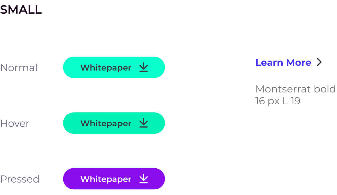
Buttons
The process consisted of: interview with the client to form an overview of the brand- customer personas, brand tone of voice, feel, impact, values, objective goal, personal approach of the brand. Clarifying competitors. The client received three presentations in total with solutions according to different brand aspects, keynotes and comments.
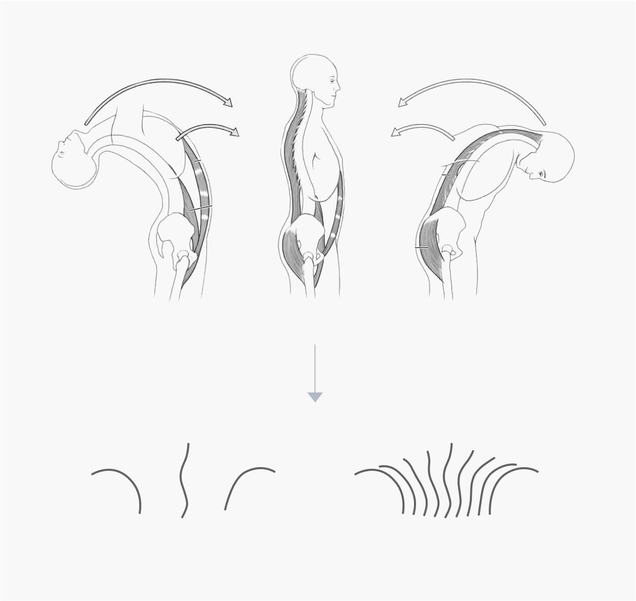
The Resulting design describes the range of motion of the spine (spine dynamics), measured at different points in time. Also embodying the personalised data (fingerprint pattern) and the initial letter of Dynback - “D”.